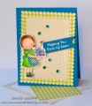
I put the accent on the neutral color here, Sahara Sand. I downplayed the two colors that make my lips freeze, Pacific Point and Cucumber Crush. I am so anxious to see cards where these colors are highlighted, because for the life of me, I couldn't come up with an idea to really showcase those two colors. Anyway, after about 4 or 5 attempts I decided this card was IT! Phew!! A real challenge for me. Happy Tuesday everyone!!
Date: Monday, January 4, 2016 GMT Views: 4801
Favorited:14
Splitcoast Dirty Dozen Splitcoast Challenge Hostess Proud Fan Club Member
Registered: September 24, 2007 Location: WA Posts: 13984
Mon, Jan 04, 2016 @ 7:43 PM
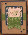
Well, Karen, I think your teapot looks just like a real ceramic teapot, decorated with those pretty blue and green flowers! A wonderful card. Looks like you had it planned out from the beginning, a first choice! So pretty!
------------------------------ Barbara Splitcoast Dirty Dozen My website: Inky Fun SCS Fan Club Member Color Challenge Team Member QFTD215
Splitcoast Dirty Dozen Alumni Proud Fan Club Member
Registered: June 19, 2010 Location: SC Posts: 6005
Mon, Jan 04, 2016 @ 8:11 PM
Karen, perfect colors to design a lovely china teapot! I love the little blue knob for accent on the pot. I lift my cup of tea - cheers, and Happy New Year! Stay warm my friend.
Registered: October 30, 2007 Location: Posts: 26718
Mon, Jan 04, 2016 @ 8:14 PM
Karen, I LOVE, LOVE how you used the colors on the teapot and cup - brilliant way to tone down the overall color scheme if you are not looking to create a bright card. And that lace pp is divine!
Registered: April 16, 2008 Location: Meridian, Idaho Posts: 8507
Mon, Jan 04, 2016 @ 8:21 PM
Oh my goodness, Karen, I want that pattern on my new China set! You have created such a lovely scene, but I'm not surprised, you always have such creative ideas! Beautiful card!
------------------------------ Stef
Splitcoast Color Challenge Design Team Splitcoast Dirty Dozen Alumni
Splitcoast Dirty Dozen Alumni Splitcoast Challenge Hostess The Charmed Life
Registered: November 19, 2005 Location: Bethel Park, Pa Posts: 37229
Mon, Jan 04, 2016 @ 8:49 PM
hahahaha-I love your card title and Peggy's comment - too funny-but seriously-this card is beautiful-I want this set-so perfect for tea lovers nd I know quite a few and the dsp is awesome
------------------------------ Mary Marsh SCS Color Challenge DT Coordinator My Blog- The Charmed Life
Splitcoast Dirty Dozen Creative Crew SU Design Team Alumni
Registered: January 7, 2007 Location: Southern California Posts: 42877
Mon, Jan 04, 2016 @ 11:35 PM
Karen, you crack me up!"Your lips freeze!" Ha! So funny. I do share your intimidation with Cucumber and Pacific, no less on the same card. You have been innovative by embracing the neutral and creating a beautiful tea scene for us today. Relax, another week down!
------------------------------ Kathy Stamp n Sip with me
Registered: January 6, 2004 Location: Connecticut Posts: 20543
Tue, Jan 05, 2016 @ 3:20 AM
Beautiful as always, Karen. It would never have occurred to me to lean more towards the neutral with this palette, but it is wonderful!
------------------------------ Rediscovering the simple joy of stamping and exploring my art! Stamp your ART out! Share your thoughts. Let your heart sing.
Come check out my Gallery and leave a comment!
FS465


 Happy Tuesday everyone!!