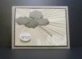
For this week's rays of light inspiration challenge. I stamped the branches c-a-c background, using two shades of gray and black. There were some quiet areas where I added some flourishes. I tried to create the rays by sponging white pigment ink (What was I thinking?!)-- fail. So I fussed with a white marker and wink of stella. Still not happy. I gave it one last stamp with black on the left side, which was intended to make that tree stand out more in the foreground. It all looked so gloomy that I used te's new fancy banner set as a sentiment, to lighten things up a bit. Eh!
tfl
Date: Saturday, April 11, 2015 GMT Views: 1796
Favorited:3
Splitcoast Dirty Dozen Alumni Favorites Team Notifier Splitcoast Challenge Hostess
Registered: October 26, 2009 Location: Oakhurst, near Yosemite Nat'l Park. Posts: 46755
Sat, Apr 11, 2015 @ 6:00 PM
You did wonderfully, are you kidding??? This is great Brenda! Love how you made the light go in and out of the branches...I went the chicken way and just painted them under my tree layer! I love your card!
------------------------------ Blessings, Robin Encourage one anotherMy Blog-InkMagination , QFTD201,Dirty Dozen Alumni.Impression Obsession DT, DRS DT.Formerly HC DT, ODBD DT.
Registered: May 25, 2006 Location: So. Oregon Posts: 121526
Sat, Apr 11, 2015 @ 7:41 PM
oh my gosh this is so cool!
(you're over thinking it, I am not seeing gloomy at all more like those winding highways towards the coast where all the trees lean over the road so the light has to peek through...)