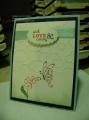
For the new Color Throwdown challenge: green, light blue, orange and dark blue. So...I goofed and interpreted it as black. Well...we say to use something close, so I'm calling this close - lol! I was inspired by a video on Jennifer McGuire's blog that featured Dawn Woleslagle showing how to stamp florals and leaves with WPlus9 Pure Color dye inks then adding details and shading with Copics. Let's just say I have a lot of practicing to do yet! While the leaves suited me OK, the flowers just didn't have enough definition. The ink just wanted to bleed more than I liked and appeared too blurry. The next morning, I came back to the card and stamped the second detailed image using Crisp Cantaloupe by SU and then the definition was visible. Some stamped off splat images and some sequins finished it off.
STAMPS: Coming Up Roses, Spring Blooms, Fresh Cut Florals, Hand Lettered Thanks, Ink Splats - all by WPlus9; Burlap BG stamp by MFT.
PAPER: Soft Sky, X-Press It Blending Card.
INK: Miami Spice, Mojito, Lake House dye inks by WPlus9; Versafine Onyx Black.
ACCESSORIES: Pretty Pink Posh sequins.
COPICS: YG03, YG63, YR00, YR02, YR04.
Date: Tuesday, February 3, 2015 GMT Views: 225
Favorited:4