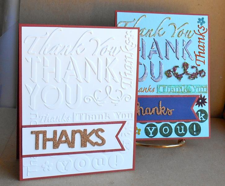
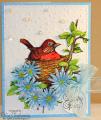
Here's the story. Last Monday, I tried the color-the-texture challenge on the blue panel, hated it and tossed it. Today, I pulled it out of the discard stack and started with the glitter/metallic pen/flowersoft (a mistake, I'm thinking. The flourish looks like a scurvy moustache!) to add texture on top of texture. Still hate it.
I then did the same ef with neenah natural white. I layered a cork die-cut thanks on cs over a scrap of handmade paper with the fishtail flags. So, both cards meet the criteria for wtui.
and of course I much prefer the CAS one.
Okay, so we'll call this effort worthy (?) of the dirty more is more challenge.
tfl
Date: Thursday, July 10, 2014 GMT Views: 3891
Favorited:3
Splitcoast Dirty Dozen Creative Crew SU Design Team Alumni
Registered: May 18, 2004 Location: Southwest Michigan Posts: 36959
Thu, Jul 10, 2014 @ 11:17 AM
Ha Ha Brenda : ) I struggle with that "color the texture" technique as well! I like your CAS card best, too! The cork sentiment looks great against the white embossed thank you folder.
------------------------------ Claudia Splitcoast Fan Club Member
Splitcoast Dirty Dozen Alumni SCS Gallery Moderator Splitcoast Challenge Hostess Teapot Tuesday TEAm
Registered: July 27, 2007 Location: Dublin, Ireland Posts: 131398
Thu, Jul 10, 2014 @ 12:07 PM
I like the glitter and metallic pen on your more-is-more one - and the flower soft is certainly texture! But I have to admit I too prefer the CAS one - the crisp texture and the cork lettering are just great.
Registered: August 7, 2007 Location: North Carolina Posts: 28113
Thu, Jul 10, 2014 @ 3:51 PM
Well I really do love them both, but have to admit I like the white bg one the best. Lots of great texture on both!!!
------------------------------ MY GALLERY My BLOG
No card is complete without at least one cat hair
DT: Our Daily Bread designs
Happily a Fan Club Member Romans 6:23