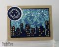
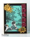
This is for MIX72 - Some Like It Hot. Our mission this week was to apply heat in making our cards. I started by heat embossing my Flourishes BG stamp with clear EP on Soft Sky cardstock, and then sponging over the embossing with Distress Ink in Stormy Sky. Then I used my craft iron to remove the EP (so, more heat). My moon was heat embossed using white detail EP. So plenty of heat going on here.
I don't think I've ever shot a picture of a card that wasn't straight head-on, but in this case I thought a slight slant would make it easier to see the shimmery paper I used for stars and the mat behind the moon, and the silhouette diecut behind the skyline diecut (slightly offset, as if the buildings had a golden glow on one side) but, alas, I don't think it worked too well. I guess I am going to have to either start hiring a professional to photograph my cards or start not caring so much how "completely realistic" they look in photographs. I think, financially, the second option makes more sense. So - believe me people, there is very shimmery gold paper behind the buildings lighting those little windows and the stars and the matting for the moon are really iridescent!
Fun challenge! Thanks for looking!
Date: Friday, June 13, 2014 GMT Views: 1400
Favorited:6
Splitcoast Dirty Dozen Alumni SCS Gallery Moderator Splitcoast Challenge Hostess Teapot Tuesday TEAm
Registered: July 27, 2007 Location: Dublin, Ireland Posts: 131551
Fri, Jun 13, 2014 @ 12:28 PM
Robin, this is WOW! I love it - you know that I like using that flourish stamp for sky, and your moon and the stars are a wonderful addition. It looks brilliant slightly offset in the white circle, creating a crescent halo.
I was looking at those MB dies as something DH could give me as part of an anniversary present - maybe I should have got them because I said I'd like a new computer and I'm still waiting.
I wouldn't worry about the photography. Some things, like shimmer and shine and sparkle, are so hard to capture unless the light is just right. And we all know that, so when you describe what you've used, we know what it must look like in real life. And practically always a card looks better in the hand no matter how good the photography. I have a problem in that I work on a large monitor - and depending on whether I view my card at the top of the screen or down at the bottom, it looks different. So who knows what it looks like to someone else who's monitor is calibrated differently! Do the best you can and be happy with that.
Registered: August 15, 2007 Location: Twin Cities MN Posts: 50476
Fri, Jun 13, 2014 @ 4:39 PM
Outstanding card!! That flourish bg as sky is inspired..it has a dreamy quality to it. And I love the Rubbermoon moon..they have such great celestial images..it goes really well with the nightscape. A very creative card! I agree with Sabrina that the details on our cards are sometimes really hard to capture in photos...don't sweat it ;)
Registered: April 1, 2012 Location: Rogers, AR Posts: 28837
Sat, Jun 14, 2014 @ 5:20 AM
WOW! This is amazing - love love love this!!!
------------------------------ Jan 'Being confident of this very thing, that he which hath begun a good work in you will perform it until the day of Jesus Christ'. Philippians 1:6
Registered: December 15, 2011 Location: Abilene TX Posts: 11275
Sat, Jun 14, 2014 @ 8:13 AM
This is fabulous! I love everything about it, but the moon just makes me smile each time I look at it. The cityscape looks terrific with the glowing windows, and the sky is awesome!
------------------------------ JodyLynn - "Love me - love my cats!" DTGD12, DTGD14, HYCCT12, HYCCT13, HYCCT14, HYCCT15, Love Fest 2013, Love Fest 2014 CAS and CC guest designer QFTD 258