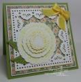
Today I am sharing a Vintage-inspired Thank you card which I made for the owners of the holiday house where we stayed at Bright (in Victoria, Australia) in March. We have been staying there since my daughter was in a Port-a-cot (she is almost 11 now!) and they have been so kind to us over the years. I specifically chose a rose for my card because the owners love roses plus they gave us a rose to plant in our garden when we left the holiday house - so it only seemed fitting to use a rose image. The image came on a diecut sheet from Reddy Creative Cards Ar.83873 - but I did trim a few parts that weren't perfectly diecut and then used a matching green and red Tombow pen to go around the edges of the diecut pieces to eliminate any white showing. This makes a huge difference to how a papertole (or decoupage if you are in the UK) image looks once you have finished layering it up and helps the edges blend in alot better.
Now I am not very good at Vintage cards or distressing: I think I am too neat and maybe my style is a whole lot more simplistic compared to other seasoned cardmakers of that genre - but I do love what other people do with their cards. I often look at that style and almost envy their ability to add this and that and then a whole lot more bits and pieces, and then tear the paper etc. and their card looks just perfect. Yet, if I add bits and pieces, my cards look too busy! So that is why I called my card "Vintage-inspired". If you don't hear from me again, you know that the Vintage Card Police got me LOL!
The designer paper is by Graphic 45 - Little Darling Collection - Precious Poesy (yes, that's how it's spelled!) and just seemed to match my image perfectly (I love it when that happens!).
Believe it or not, each layer has been roughed up a little with a We R Memory Keepers heart-shaped distressing tool and then I used my Ranger Blending Tool to add Hero Arts Soft Sand Shadow ink to each layer around the the edges including the rose panel.
The sentiment is from a Stampin' Up! set called Simply Sketched and was stamped with Versamagic Tea Leaves chalk ink then I added 3 Split Pea RS407 Kaisercraft rhinestones.
The gorgeous silk ribbon is by May Arts and is 1 inch wide (or 2.5 cms). I am sorry that I can't remember the colour name: it is either Moss or Olive. I added the ribbon in 2 separate elements and the bow itself was made with my Bow Easy and was glued on using Fabric glue. I added Fray Stop to the cut ends to stop them from fraying as silk frays terribly!
All the layers were trimmed to 1/8" using my Perfect Layers Tools. The bottom panel was punched using a Martha Stewart Doiley Lace edge punch. There is a Scor-Pal line above the punched edge (a bit hard to see in the photo) which gave me a straight line to butt the designer paper up against.
Registered: February 22, 2012 Location: Cape Cod Posts: 43340
Sun, Apr 27, 2014 @ 3:24 PM
I don't think you have to worry about the vintage police knocking on your door! This is GORGEOUS! The roses look so real and the ribbon is absolutely beautiful!
------------------------------ Priscilla (aka - PJ)
QFTD187 My Gallery
Registered: July 9, 2008 Location: Stars Fell on Alabama Posts: 75034
Sun, Jun 08, 2014 @ 6:23 AM
Wow! This is a beauty. The rose looks as if you just cut it from the garden. No vintage police will be coming for you, that's for sure. I love your pretty ribbon/bow. Outstanding!
------------------------------ My Blog---My Gallery---My PinterestI'm a Punchkateer! (Prez) FOREVERDirty Dozen Alumni2014 CAS Spring DT--- Inspiration Challenge Co- Hostess 12/02/17-12/28/19 Watercolor Wednesday Design Team Hebrews 13:2Brenda