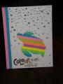
Ha! This is an epic fail. It goes to show you how much struggle I have when outside of my normal subtle colors. I rarely work with primary colors and you can see how my design didn't really work with these intense colors. I colored the small swipe with SU markers in a row of colors that emulates the rainbow. When I stamped the silhouettes over, they didn't really pop due to the deep shades of the primary colors. I'll probably recreate this with softer colors next.
Thanks for viewing.
Date: Friday, March 14, 2014 GMT Views: 1502
Favorited:3
Splitcoast Dirty Dozen Alumni SCS Gallery Moderator Splitcoast Challenge Hostess Teapot Tuesday TEAm
Registered: July 27, 2007 Location: Dublin, Ireland Posts: 131482
Sat, Mar 15, 2014 @ 3:41 AM
It's certainly not what I would call a fail - I'm sure it's entirely because the colours aren't "your" colours that you think so. I really like strong brights ., and I love the little bow tied on your silhouette spray. If you embossed the spray after the rainbow was totally dry, that would have given it a little more punch, perhaps?


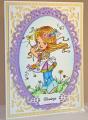


 ., and I love the little bow tied on your silhouette spray. If you embossed the spray after the rainbow was totally dry, that would have given it a little more punch, perhaps?