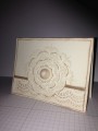
I wanted this card to have a balanced feel between "masculine and feminine." The embossed stripes remind me of a man's cravat/tie and gives the card an elegant feel. The pearls are for the feminine touch . The Smoky Slate gray color is a perfect, rich, neutral color for both genders.
The Summer Starfruit ink color is also far more subtle-looking than it appears in this photo, it's warm and welcoming! There is Dazzling Details Silver Sparkle in the flower centers also; hard to see.
I hope you like this; thanks for looking!
Date: Friday, August 9, 2013 GMT Views: 2436
Favorited:0
Registered: February 23, 2005 Location: Twin Cities, MN Posts: 2042
Fri, Aug 09, 2013 @ 9:42 PM
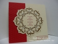
Love it, Donna! I was having trouble imagining that embossing folder with something other than a Christmas card, but it works perfectly on this wedding card. Thanks for sharing!