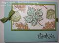
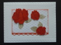
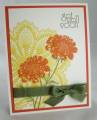
It seems that lately my time hasn't been my own. So I just took some quality time in my studio! The challenge to-day has such wonderful colours in it. White - for my basic card (can't go wrong with that). Calypso Coral (love it and a perfect colour for roses!) Sahara Sand (a nice neutral that can pretty well do any job). Primrose Petals (didn't have any of that cardstock but did have the ink) so I used it as the second stamping on my roses. As it turns out it got more coral than primrose which worked out fine..providing the challenge police don't object! I used two cuttlebug folders on the white and punched a stray piece of calypso coral with the loopy punch from SU. Added a gem for a dew drop and poof Bob's your Brother-in-law!
Date: Monday, July 15, 2013 GMT Views: 1186
Favorited:4
Registered: April 19, 2006 Location: Waterford, WI Posts: 20540
Mon, Jul 15, 2013 @ 4:50 PM
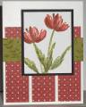
I really love how you made one color the focal point instead of trying to give them all equal space. The other colors enhance the focal point. It's beautiful.