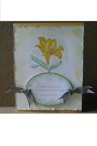
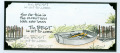
This card really looks so much better IRL; it looks dirty and grungy in the photo. I stamped the image and sentiment in dove grey stazon. Watercolor crayons were used for the lily, and I smudged white and gray crayon around the image. After distressing the white panel, I sponged grey ink on the edges, and summer sun around the border. The oval was sponged with sage shadow, summer sun, and a hint of grey. I couldn't find my grey ribbon, so I colored white taffeta with gray crayon.
Date: Thursday, June 27, 2013 GMT Views: 946
Favorited:2
Registered: March 13, 2012 Location: Southern Florida Posts: 5253
Thu, Jun 27, 2013 @ 8:36 AM
I think this is lovely, very soft and vintage-y. I know what you mean about photographing cards. I usually do all right, but this week I just could not get a good photo of my card for this challenge.
But I can see how pretty this is! No worries!
------------------------------ I have come to the conclusion that buying craft supplies and actually using them are two separate hobbies. RachelRose Designs by Robin... GALLERY
Registered: September 8, 2008 Location: Idaho Posts: 3787
Fri, Jun 28, 2013 @ 10:45 PM
I love the No Line Coloring technique. Your flower turned out lovely and the smudging is just the right texture to go with it. Thanks for playing with the Mix-Ability challenges. Come join us again!
------------------------------
- Janelle
Fan Club Member, Dirty Dozen Team, and Challenge Hostess