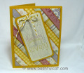
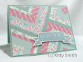
I was inspired by a card I found on Pinterest, at http://skrapki.blogspot.com/2012/02/...nd-hearts.html. I liked the idea of bright colors on a black card-base. The strip of patterned paper (grey flowers), the black Washi tape, the little black heart, and the teal and black cardstock are all from the April kit. The yellow Washi tape was from the March card it. (Everything else is just from my misc. stock.) I wanted to put three brads at the top, but didn't have ones that matched, so I punched out three circles from the teal cardstock and covered them with Glossy Accents.
Thanks for looking!
Date: Monday, April 22, 2013 GMT Views: 1217
Favorited:6
Splitcoast Dirty Dozen Creative Crew SU Design Team Alumni Splitcoast Challenge Hostess
Registered: November 28, 2004 Location: St. Paul, Minnesota Posts: 11220
Mon, Apr 22, 2013 @ 5:46 PM
I love your color combination - the card is really striking! You did a great job capturing the essence of the pinterest piece while still making it your own.
Splitcoast Dirty Dozen Alumni Stamp Like You Mean It
Registered: March 24, 2006 Location: Posts: 38589
Sun, Apr 28, 2013 @ 5:19 PM
Wonderful color and design Kitty. I really like how your baker's twine gives it the "pop" too!
------------------------------ Pat Smethers "The Lord will guide you always; He will satisfy your needs in a sun scorched land and strengthen your frame. You will be like a well-watered garden." Isaiah 58:11