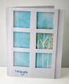
I made this card for the Window of Hope challenge.
I totally failed to use pink. I don't know what the deal is but I am in blue mode! I considered adding some pink rhinestones or something but really liked how clean it looked so...no pink.
For some reason the lighting was really weird and the photo isn't as clear as I would like, but the box to MD Anderson Cancer Center is sealed, so this is what you get!
I started by making the window with a square punch and a ruler. The stamps are from the new CAS-ual Fridays Stamp set Calm and Gentle. I lightly traced the center right square to guide my stamping. I stamped the trunks in VersaMark and embossed them in white, because aspen bark is white. Then I stamped the leaves in SU Summer Sun (retired) and lastly I used my Fiskars stamp press to stamp over the yellow with VersaMark which I set with clear embossing powder. All that embossing made the leaves shiny, and the trees resisted the Tumbled Glass Distress Ink that I sponged on to make the sky.
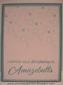
I popped the window up on tiny foam dimensionals and stamped the sentiment in Broken China.
It was another one of those cards that was simple but not easy. I have got to stop stamping on my card bases! It took three tries, but the first was because I forgot my plan to emboss the trunks in white . I should have done the leaves first so the trunks would be behind them, but I couldn't get the spacing right. I might re-make this for my mom and try it that way.
Date: Friday, November 2, 2012 GMT Views: 1145
Favorited:7
Your punched windows are perfect and not easy to get lined up easily. You did such a beautiful job on the tree and sky scene out the window. Thanks for playing in my challenge.
Splitcoast Artist in Residence Splitcoast Dirty Dozen Alumni Mix-Ability Challenge Hostess
Registered: October 19, 2004 Location: Warsaw, MO Posts: 17004
Sat, Nov 03, 2012 @ 3:08 PM
Were we supposed to use pink? I don't think there's any pink on my window card either... heh! I love the creative simplicity of your window scene and sky - it's very rustic and inviting, and the contrast of the orange is just really really cool. Thank you so much for supporting Hope You Can Cling To!!


 . I should have done the leaves first so the trunks would be behind them, but I couldn't get the spacing right. I might re-make this for my mom and try it that way.