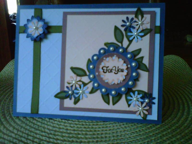
I just found my color wheel and thought it would be nice to stick to the suggestions on it ;) I used Not quite Navy, Always Artichoke, Close to cocoa, Bashful Blue and Blush Blossom. The ribbon is Always Artichoke as well. I used the lattice texture impressions from SU and the sizzlet of the leaves also. The flowers looked pretty bare all by themselves so I put some pearls in the center and colored the tips of the flowers with the same color ink as the paper to give them more dimension. TFL =)
Date: Monday, October 8, 2012 GMT Views: 1984
Favorited:3
Registered: July 9, 2008 Location: Stars Fell on Alabama Posts: 75073
Mon, Oct 08, 2012 @ 9:48 AM
Very pretty, great colors, and nice texture. Lovely card!!
------------------------------ My Blog---My Gallery---My PinterestI'm a Punchkateer! (Prez) FOREVERDirty Dozen Alumni2014 CAS Spring DT--- Inspiration Challenge Co- Hostess 12/02/17-12/28/19 Watercolor Wednesday Design Team Hebrews 13:2Brenda
Registered: August 21, 2007 Location: Wayland MA Posts: 105288
Mon, Oct 08, 2012 @ 10:00 AM
The scoring is the perfect touch. Adds dimension without taking away from the flowers!
------------------------------ Anne HarmonFS154, QFTD58, PROUD FAN CLUB MEMBER (photo of our Great Granddaughter Elise, just 6 months old) and me, even older.