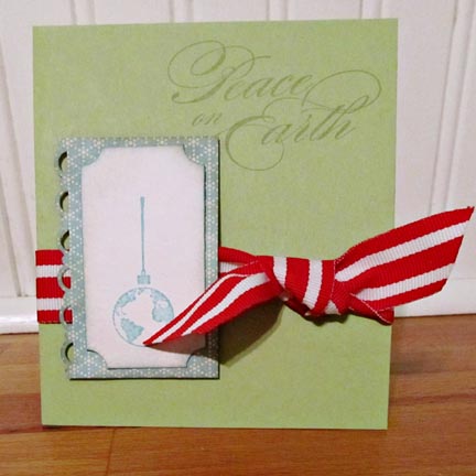
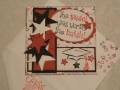
Well, I liked this idea, but the whole thing flopped.
It's, but I think it would have been better with an embossed layer behind it all to give it oomph. I thought the idea of the pale sentiment was a good one, but it should have been embossed instead at the least.
Oh well. It works.
And, hey, I've got 227 done now. That has to count for something.
Date: Tuesday, November 15, 2011 GMT Views: 354
Favorited:2
Registered: May 25, 2006 Location: So. Oregon Posts: 121721
Tue, Nov 15, 2011 @ 9:07 PM
its not a flop card...
another thought is switch out the ribbon for brown? or ink over the ribbon with an distress ink to tone it done a hair for the second one?
just a thought. its not that the sentiment doesn't pop for me, its that the ribbon is louder.