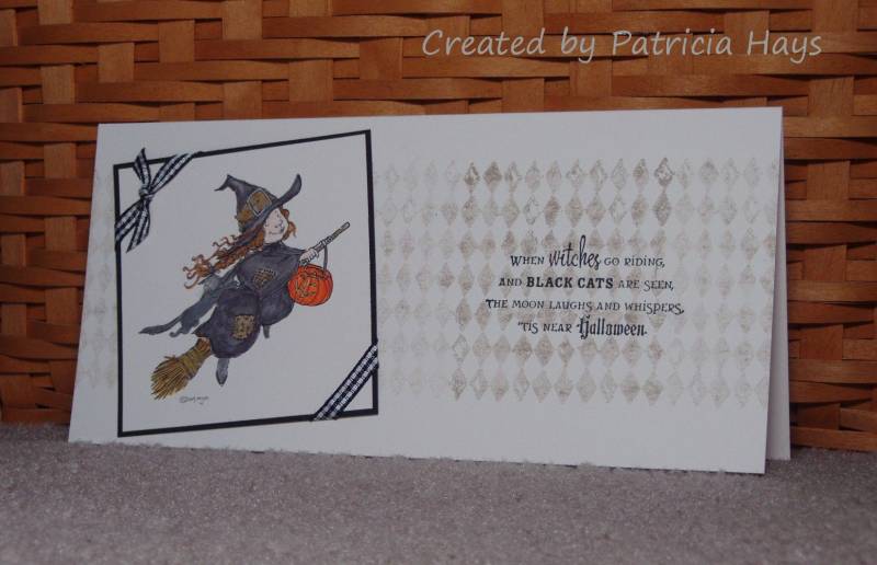
I decided to throw my proverbial hat in the ring for the CAS Fall Design Team. We had a photo of a Halloween-themed pillow to use for inspiration. I took cues from the shape of the pillow, the colors used, the harlequin motif, the gingham ribbon, the interesting angles, the witch on the broomstick, and the sentiment with multiple lines.
I have to admit that coloring this image was even farther out of my comfort zone than applying for the design team! It was hard using dark colors for the witch's clothes and cat without losing all the detail in the image.
But anyway, I've given it a try, and I'd like to wish all the other applicants the best of luck.
Comments are welcome! Thanks for taking a look at my card. For more information and a close-up view of the image, please see this blog post.
Date: Thursday, August 25, 2011 GMT Views: 2062
Favorited:4
Stamps: witch: Halloween Witch digital image (Mo's Digital Pencil); harlequin design: Looks Like Spring (Stampin' Up); sentiment : Sweet & Spooky (Lizzie Anne Designs)
Paper: Vintage Cream (Papertrey Ink); Basic Black (SU)
Ink: Crumb Cake (SU); Onyx Black (VersaFine); printer ink
Accessories: black gingham ribbon (SU); Premier colored pencils (Prismacolor)