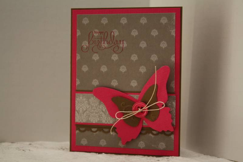
I realized today I have not touched my Melon Mambo paper or ink yet. Bright pinks are not normally a color I gravitate to. This color combo is nice though. The neutrals really help to tone it down some. I don't have Crumb Cake but I think the dp is close to it.
I must say I regret using the Melon ink for my sentiment, I should have used the Soft Suede. In fact it's driving me nuts, but what's done is done. :0}
Date: Tuesday, June 28, 2011 GMT Views: 1569
Favorited:12
Registered: June 9, 2006 Location: Wauconda, IL Posts: 55665
Tue, Jun 28, 2011 @ 2:17 PM
You did a really nice job with these colors!! Your card looks nice and neat. The dp was a good choice. The sentiment in melon does not bother me at all. It's interesting. I think my card turned out bad today, but apparently people aren't seeing what I'm seeing, or they're being nice.
Splitcoast Dirty Dozen Alumni Splitcoast Challenge Hostess The Charmed Life
Registered: November 19, 2005 Location: Bethel Park, Pa Posts: 37103
Tue, Jun 28, 2011 @ 2:39 PM
this is very pretty-you used the challenge colors well-I must say I like the melon mabo ink on your dp-I think soft suede might have blended in too much
------------------------------ Mary Marsh SCS Color Challenge DT Coordinator My Blog- The Charmed Life