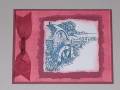
I cased this one from Impress5524 and changed a few things. I thought it would help to add ribbon, but I can't decide if it works or not. I used Lavender Lace on the left one for the solid stamp. I tore a hole in a piece of scrap paper to get the canvas background.
Which parts of these do you like?
Date: Wednesday, December 14, 2005 GMT Views: 1017
Favorited:12
Registered: June 14, 2004 Location: Portage, MI Posts: 3405
Wed, Dec 14, 2005 @ 3:01 PM
Wow... this is tough! I think I definitely like the lighter solid flower... just adds more contrast and pop. As for the ribbon... hmmm... not sure! I just don't know if I have a definite preference - they are both nice! And I LOVE the tearing/background effect!!! Sorry I couldn't be more help... I keep re-looking at them and just can't decide!
------------------------------ ~ Kelly, who seemed to stamp a lot more before she *had* to!
After 11 years as a demo, guess I'm not so"new" anymore!
Registered: February 10, 2005 Location: Posts: 453
Wed, Dec 14, 2005 @ 6:02 PM
I love how you did the background...great idea. I like the lighter flower and but with the ribbon on the right. I also like the extra layer on the right.
Registered: April 26, 2005 Location: Woof, eh? Posts: 7675
Wed, Dec 14, 2005 @ 7:10 PM
Beautiful! I like the card on the right better -- both the ribbon and the colours of the flowers. I *love* the background! I'm going to have to try it!
------------------------------
You don't have to take on the world, just get on its good side.
Registered: October 17, 2005 Location: East Bethel, MN-north of the Twin Cities Posts: 4308
Wed, Dec 14, 2005 @ 9:13 PM
Looking at the thumbnails I liked the one on the left best, the composition seemed best, but once I saw the close up...it really is hard to decide. I'd say it's a draw and you should use the one you like best. I, also, am going to have to try this background. Very cool! TFS