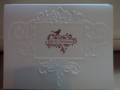
I changed the images
I changed some of the colors in the layout.
Instead of ribbon, I added pearls.
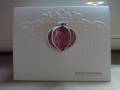
I stamped the image in versamark and used some pink embossing powder w/ glitter. It was VERY hard to photograph and the picture does not look anything like the card.
TFL!
Date: Sunday, August 15, 2010 GMT Views: 628
Favorited:3
Registered: September 7, 2004 Location: Sand Lake, NY Posts: 12409
Sun, Aug 15, 2010 @ 12:50 PM
Oh how wonderful. I often think of your peach colors and Kathy's moss colors as going well together. You certainly did a nice interpretation of her card.
Splitcoast Dirty Dozen Creative Crew SU Design Team Alumni
Registered: January 7, 2007 Location: Southern California Posts: 42871
Sun, Aug 15, 2010 @ 1:55 PM
This is a classic beauty. I can see hints of the sparkle around the edge of your lovely butterfly. It was so nice of you to visit my gallery today and post a CASE for me. Thank you so much.
------------------------------ Kathy Stamp n Sip with me
Registered: August 21, 2007 Location: Wayland MA Posts: 105266
Sun, Aug 15, 2010 @ 3:33 PM
Just beautiful!! Great color combo, and fab embossing!
------------------------------ Anne HarmonFS154, QFTD58, PROUD FAN CLUB MEMBER (photo of our Great Granddaughter Elise, just 6 months old) and me, even older.