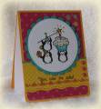
A week later and I still just was not thrilled with this card. So maybe the colors aren't my favorite, but they aren't ugly. So it wasn't that. In the end, decided they were just too dark for a focal image that screamed summertime to me. Decided to redo by pairing up with some bright and sunny dots and I'm absolutely loving the way it ended up. Hope you enjoy it as well.
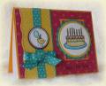
The center of the flower in the upper left was made by punching around the design of the razzleberry dsp, attaching with a glue dot and then covering with crystal lacquer.
If the sun is out tomorrow, I'll try getting a better picture. The scalloped circle is actually razzleberry, but I notice it is looking more brown in the pic -- at least on my home PC.
Date: Sunday, February 28, 2010 GMT Views: 319
Favorited:3
Registered: March 11, 2008 Location: Sacramento, California Posts: 39766
Sun, Feb 28, 2010 @ 9:38 PM
Very pretty. So spring like. Nice re-do even tho your other one was pretty too. TFS :0)
------------------------------ Cathy B aka: Mutnik ....or is it Nutmeg?! I get so confused!
Smile.......people will wonder what you are up to! :0) Proud Fan Club Member 2010 DT forRubbernecker Stamps My Gallery