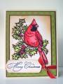
I have had this stamp for a very long time! Used Prismas and Baby Oil for the coloring....took quite sometime to get the best color combo down. Had to cover up the sentiment on the orginal stamp and I can see now that the one I used to cover it up is a bit crooked....oh well! Hope you like it!
Registered: April 4, 2009 Location: El Paso,Tx Posts: 132
Mon, Aug 10, 2009 @ 7:19 AM
:ob-ful,I luv the red cardinal. I luv my Prism pencils. I just use my stump after layering my pencils .I'm chemically senstive,so I can't do the gamsol.:pUR tech's are great.:-D I loved the 130 pg. thread I found on here,it really helped
------------------------------ I luv to cut,color & paste.I must not gotten enough of this as a kid. This is my excuse to play w/ my toys in my room. It's cheaper than therapy!!!
Registered: December 26, 2008 Location: Brooklyn, NY Posts: 18
Tue, Aug 11, 2009 @ 12:22 AM
Beautiful job on the coloring. As per your request for feedback, I think just a little more white space around the cardinal would have created a bit more contrast between bird and background. Conversely a tiny touch more color around the edge of the tag would have made it pop a bit more. I think the background green paper is perfect. Great job.
Registered: August 20, 2007 Location: Redmond, WA Posts: 2169
Tue, Aug 11, 2009 @ 8:45 AM
Beautiful card! If you want to give a more natural look to the bird, you could use more colors where there are lines for feathers - just use a darker shade in the same color family along the lines.
------------------------------ My Blog: Ribbons,etc.


 UR tech's are great.:-D I loved the 130 pg. thread I found on here,it really helped