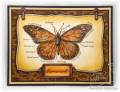
This was a fun card, I enjoyed just coloring the image. I thought I had done pretty well putting colors in the right places to make it look like a Monarch... I knew I had some Graphic 45 paper with butterflies on it too, so I planned on pairing that paper up with this stamp. I found the paper I was thinking of.... my butterfly colors looked not quite like the Monarch butterflies in the paper. In fact they were so different enough that they would have clashed!!! So I had to change direction!
I created the background using a Cuttlebug Folder, embossing a piece of Brown card stock. I used my mini brayer to add Copper ink over the raised portions. I used my finger to rub the ink around, adding a hint of ink in the debossed areas too. Then I coated the panel with Clear embossing powder.... resulting in a shiny look. I think you can see it better if you enlarge the close up pic (on my blog). Since I had some shine going on in the background I added some Crystal Lacquer randomly over my butterfly image. I also used it to fill in the depressed area of the Copper tag. The addition of the Copper tag and Copper photo holder pieces was to play in the Belli Challenge #70, which called for the use of metal tags. I have been enjoying a range of new challenges as they really help me to pull out all sorts of products and techniques that I need a reminder to use.
Very nice. It looks like it belongs next to the real specimens. Just lovely I think your colors look great..Don't tell us next time. I don't think we have alot of scientists looking that close to notice. Great job!
Registered: April 10, 2006 Location: Alberta, Canada Posts: 8280
Fri, Aug 07, 2009 @ 5:55 PM
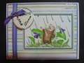
Jenny, I still love this one - I absolutely adore this stamp!!! Your pear card still haunts me - in a good way. You have the BEST stamp collection so I wish we were neighbours...