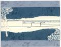
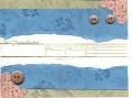
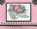
Okay, I've been obsessing about this for the last couple of hours and have no idea what to do to improve this card. I know it needs hardware, but I have about 30 to do for a swap, so that's not an option. The color wheel gave me the colors (Not Quite Navy, Artichoke and Close to Cocoa). Maybe the colors are the problem?? The other stamp set with this is Frames & Flourishes. Okay, you expert stampers............any suggestions? Or do I trash it and start working on a new idea??
Date: Monday, August 8, 2005 GMT Views: 1884
Favorited:4
Registered: April 24, 2005 Location: Nebraska Posts: 6529
Mon, Aug 08, 2005 @ 10:22 PM
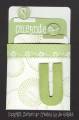
My critique would be that I can't tell what type of party it's for - maybe you could attach a sentiment by the buttons or make the button attach the sentiment to the card somehow? And if you want to tie in the brown buttons more, I'd stamp the invitation part brown, only because it's easier to read with those fancy fonts on the stamp. Otherwise, it is a nice card! You should post what you end up changing your card to look like in the end (if you do change it).
Registered: January 16, 2005 Location: Coeur d'Alene, Idaho Posts: 713
Mon, Aug 08, 2005 @ 10:50 PM
I agree with basketmom, the invite should be done in the brown, to tie in the brown buttons, and make it easier to read, maybe also change color of corners, stamp them in cocoa still but, maybe on the vanilla to match the invite portion??? Great combo of sets, they work well together... nice job! Please do post the finished product, and good luck with the swap!
------------------------------ Bridgette
"His way is PERFECT"
Excellent. That will be my agenda for tomorrow night. What you don't know is that the invite part is actually stamped on vellum with staz-on (hence the green, I used Olive). My brown staz-on is also green. (it's one of the old messed up ones), so I guess I need to order a new one. Maybe I'll switch to vanilla paper, brown ink, vanilla corners. Not sure about the tag idea (I love it, just not sure what type of invite this actually is ---- LOL). I will definately post the finished product!!! Thanks everyone!!
If you are still looking for ideas, you might think about sponging the torn edges with Not Quite Navy. Also, what about Crystal Effects on the corners?
Registered: January 24, 2005 Location: Chicagoland Posts: 2850
Tue, Aug 09, 2005 @ 5:33 AM
I love the sets you've used - very elegant looking. One thing that jumps out at me are the "hard" edges of the close to cocoa strips. The rest of the card is curved & elegant. Can you layer them on top of the blue (in the same physical location) with torn edges? Or tear both horizontal sections of the blue. Just to soften the lines. BTW - the cutting on the corner sections is great! I can never get my curves that good.
Registered: July 13, 2004 Location: Perkins, OK Posts: 220
Tue, Aug 09, 2005 @ 7:55 AM
I would put a strip of ribbon - probably gingham ribbon - across the sections where the Navy meets the Artichoke to break up the line it created, otherwise - I love your card!
Registered: September 28, 2004 Location: New Jersey Posts: 1784
Sun, Aug 14, 2005 @ 4:06 PM
I agree with some of the comments. An art principal I learned a few years ago is that the eye is drawn to the darkest against the lightest. Perhaps Chocolate Chip on Whisper With would do it. I would do away with the corner pieces and buttons, and maybe round off the bottom corners of the blue and green CS. I really like the BG stamp on these 2 CS's. It ties in the design on the "You're Invited" stamp.