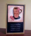
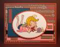
For Color Challenge, to use Pretty in Pink, Not Quite Navy, and Really Rust! EEEEK...it is the Pretty in Pink that threw me...all my paper are substitutes and the rusty paper is Basic Grey dp! Judy gets an A+++ for today though, because after her gorgeous sample, I KNEW I had to try it!
Date: Tuesday, July 21, 2009 GMT Views: 276
Favorited:3
Registered: June 18, 2007 Location: Twin Cities, Minnesota Posts: 4857
Tue, Jul 21, 2009 @ 6:53 PM
Oh, Kelly, I LOVE your cup of coffee!! You did a great job with the colors. The pink really is what through most of us off, but what a fun surprise this combo was!! You really do have some great PTI stamps!! Your liquid pearls look so sweet with your pretty pink flowers.
------------------------------ Kris Chirhart
Visit My Gallery
I finally started a BLOG!
Stamping Tech for Technique Tuesday Happy to be a Fan Club Member!
Registered: February 1, 2005 Location: Temple, Tx Posts: 37720
Tue, Jul 21, 2009 @ 7:32 PM
Great way to get all those colors in this super cool card, Kelly...the pink threw me too!!! Your paper piecing looks awesome and I love how you added the pink flowers!!!
Registered: July 13, 2004 Location: Wishing I lived closer to my kids! Posts: 61028
Tue, Jul 21, 2009 @ 8:10 PM
Aw, thanks for the A+!!
I think you get an A+ because that cup looks delicious and delightful!! AND you used my favorite KRAFT! I had a really hard time not using that today....... probably a lot of people wish I had chosen that instead of the pink! LOL
Awesome job!