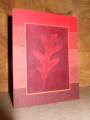
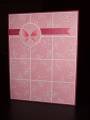
As soon as I saw this week's layout (SC220), I knew I wanted to do a gradation of colors in the background...and what color is better than red? (IMHO, of course!)
To make the main image, I did the "ink, spray and smash" technique (from SCS) on glossy paper. Then I stamped the leaf with versamark, and brayered the whole piece of paper with Bravo Burgundy and Real Red.
I think this is a great masculine card...I can never have enough of these on hand!
This shot doesn't quite do the card justice...It was very hard for me to get a good pic without getting glare from the flash on the glossy paper!
Thanks for looking!
Date: Wednesday, March 18, 2009 GMT Views: 917
Favorited:5
Registered: February 16, 2005 Location: Oregon City, OR Posts: 6897
Wed, Mar 18, 2009 @ 1:27 PM
Great mono look!
------------------------------ Ann Here is my oily blog! CLICK HERE Certified Copic Instructor - Local ClassesI love cars, stamping and essential oils!