Registered: January 17, 2008 Location: Eugene, OR Posts: 379
Tue, Mar 10, 2009 @ 8:55 AM
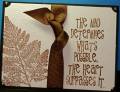
Consistency in your color scheme is good, but the ribbon is too wide. The ribbon becomes the most dominant element and blocks movement from one side of the card to the other. In this case you need to figure out which element is most important. TRy shifting the ribbon far left, the quote next to it, and the leaf pointing into the text. Then the bow will draw your eye to the start of the text, the leaf pulls your eye back into the text and you keep wanting to read it over and over. If the leaf is a background accent then try making it half as dark as the text, since right now it has the same visual weight.