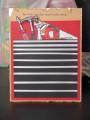
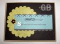
This was a page I designed for my new catalog party. There are tools in the bottom middle that are stamped and watercolored but are hard to see on the pic
Date: Monday, February 2, 2009 GMT Views: 1582
Favorited:9
Registered: January 24, 2006 Location: Grand Prairie, Texas Posts: 26876
Mon, Feb 02, 2009 @ 6:39 PM
I really like the monochromatic color scheme AND repeating the bit of twine around your journaling block. I can see the ''center'' tools just fine. Love the distressing of the title. You draw attention to the title and top photo with the extra layers... I like the casual use of Contempo alphabet (I line it up - need to do it your way). All in all, a very nice layout!
------------------------------ Do or do not - there is no try! (Yoda) / SCS Featured Stamper FS730 / Dirty Dozen Alumni