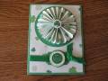
Today's Technique Lover's challenge was to use pleated paper. This is not what I had originally envisioned but this is what happened, lol. Weird how that happens--I thought I was making a wedding card and ended up with a sympathy card--to me that is funny!
Not the average colors for a sympathy card but the sentiment is more of a celebration of life type so thought it worked??? What do you think-too bright?
Date: Monday, January 26, 2009 GMT Views: 1066
Favorited:4
Registered: July 9, 2008 Location: Stars Fell on Alabama Posts: 75043
Mon, Jan 26, 2009 @ 8:16 AM
Very nice pleats and a beautiful sentiment. Love it!
------------------------------ My Blog---My Gallery---My PinterestI'm a Punchkateer! (Prez) FOREVERDirty Dozen Alumni2014 CAS Spring DT--- Inspiration Challenge Co- Hostess 12/02/17-12/28/19 Watercolor Wednesday Design Team Hebrews 13:2Brenda
Registered: March 5, 2007 Location: Coatesville, Pennsylvania Posts: 44981
Mon, Jan 26, 2009 @ 8:46 AM
Not too bright at all! Very lovely! Sympathy cards don't always have to monchromatic or subdued colors. I really like this one and especially I LOVE the sentiment! Great work!
------------------------------ Lesley Proud Fan Club and RAK Member He is the GOD of the Impossible!!!! Kookzi the Rookzie Punchkateer It is by the grace of God that we take our next breath.
Registered: August 21, 2007 Location: Wayland MA Posts: 105288
Mon, Jan 26, 2009 @ 8:46 AM
Fabulous! Cheerful, not TOO bright...great job!
------------------------------ Anne HarmonFS154, QFTD58, PROUD FAN CLUB MEMBER (photo of our Great Granddaughter Elise, just 6 months old) and me, even older.