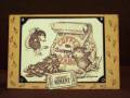
I wanted to keep this card simple with the main focus being the PEACE stamp. The DP's are inked around the edges and divided by velvet ribbon, which added to the aged feel of the stamp and hopefully the card. The hinges are from a friend's die cuts...I inked them and then added amber gems to the screw holes to add the bling factor. The stamp is chalked and the star would not be complete without a gem in the centre of it, then mounted it with 3D foam tape to make it stand out. Definately a case of...less is more! Thanks for looking
Date: Tuesday, September 23, 2008 GMT Views: 205
Favorited:2
Additional Info
Stamps: Impression Obsession - Peace Square
Ink: SU Brocade Blue
Accessories: Ambers Gems by Kaiser, die cut hinges, velvet ribbon
Registered: August 10, 2008 Location: In my stamp room, stamping, painting, and gluing... with the dogs playing under my feet.... Posts: 2848
Tue, Sep 23, 2008 @ 6:37 AM
Love the stamp and love the colors - this is my favorite of the two, but both are lovely! That stamp is impressive! And while I'm guessing it's probably a holiday stamp, the way you've used it - your color choices - makes it perfect for expressing this sentiment year round. VERY nicely done!
------------------------------ Cathy at the Seaside Rose Cottage
Registered: July 1, 2007 Location: small town near montreal, quebec Posts: 26677
Tue, Sep 23, 2008 @ 6:41 AM
I'm smiling as I read that you want to keep them simple, you do in a way but guess it's just something you do that makes them extraordinary. Fine work! Love those embellies and brads.