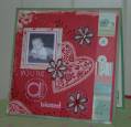
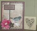
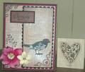
I know that the well worn words looks like it is stamped with close to cocoa, but it's not, it's actually versamark vintage sepia. In real life it actually looks almost bronzy/brown. It does look very effective in the flesh. I couldn't decide whether I preferred the yellow or chocolate flower accent teamed with the pink? I wonder what you think?
Date: Friday, September 19, 2008 GMT Views: 752
Favorited:5
Registered: July 9, 2008 Location: Stars Fell on Alabama Posts: 74834
Fri, Sep 19, 2008 @ 5:16 AM
Beautiful card! I like the vintage look and I do think the chocolate flower
is best instead of yellow. Stamps are so pretty. Great job.
------------------------------ My Blog---My Gallery---My PinterestI'm a Punchkateer! (Prez) FOREVERDirty Dozen Alumni2014 CAS Spring DT--- Inspiration Challenge Co- Hostess 12/02/17-12/28/19 Watercolor Wednesday Design Team Hebrews 13:2Brenda
Registered: November 1, 2004 Location: Red Deer, Alberta, Canada Posts: 9611
Fri, Sep 26, 2008 @ 10:00 AM
Gorgeous! Great ink for Well Worn Words..it came out beautifully and really sets a great background for your card! Love the chocolate flower...love it all!