Splitcoaststampers.com - the world's #1 papercrafting community
You're currently viewing Splitcoaststampers as a GUEST. We pride ourselves on being great hosts, but guests have limited access to some of our incredible artwork, our lively forums and other super cool features of the site! You can join our incredible papercrafting community at NO COST. So what are you waiting for?
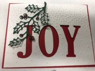
I’ve seen it used with the heavier “snow” on the top of a card, and on the bottom of a card. Which do you prefer and why? The attached picture is a possible contender for my Christmas card thus year but I can’t decide whether to put the heavier snow on the top or bottom. And before you ask, this sample isn’t even adhered with tape or glue yet and the shadow is terrible!
Would appreciate any comments.
__________________ The quickest way for a parent to get a child's attention is to sit down and look comfortable. Practice safe eating always use condiments
I'd probably put the heavier snow at the top. To me it looks more like heavy clouds letting snow fall down, rather than snow piling up. Your card would be equally pretty either way, though.
I use that EF often, not just for snow. For birthday cards I pretend it is confetti and put the heavier part on top. For winter things I put the heavier part on the bottom to look like the snow at my house in Colorado.
Mary Beth
I think it looks great like that.
Top or bottom is like glass half full or empty, I always say it depends on what you're trying to do, Half full if you are filling it, half empty if you're trying to drink it ;)
so depends on if you want it to look like snow falling down or piling up
I've also used it with drink bottles from the bottom, to represent the fizz bubbling up
Either way can work perfectly fine so you should choose. My preference would usually be heavier at the bottom, partly because snow piles up down there and partly because in general more weight at the bottom of a card/photo/etc. feels more grounded and natural. Grounded relating to the ground is not a coincidence, ha.
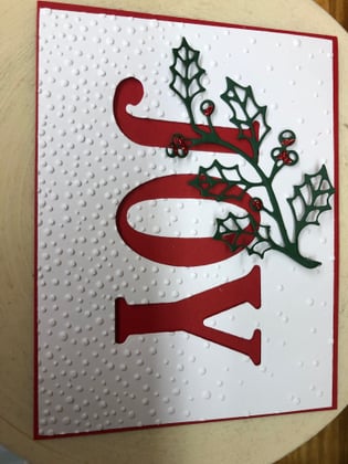
I agree that this EF looks both ways. Since you haven't glued the letters yet, could you show your card with the heavier snow at the bottom? I'd just like to see it to decide which I'd prefer in this case.
I agree that this EF looks both ways. Since you haven't glued the letters yet, could you show your card with the heavier snow at the bottom? I'd just like to see it to decide which I'd prefer in this case.
I thought I’d like the second option better until you posted the picture. I actually prefer the first one better. To my eyes, with the the holly branch pointing down, having the embossed snowfall collecting at the bottom makes the whole card “bottom heavy” visually. A direct contrast to the word Joy.
The first option seems more lighthearted. I love snow so the idea of standing outside while the snow begins to softly fall fills me with Joy.
both are very pretty but after seeing both options I really like the first one better. It looks more like a beautiful snowy evening with it falling down...
I showed the idea to my mother and she chose the piled snow on the bottom. These will be her cards and wanted to be sure she liked them.
Thanks for all the input!