Splitcoaststampers.com - the world's #1 papercrafting community
You're currently viewing Splitcoaststampers as a GUEST. We pride ourselves on being great hosts, but guests have limited access to some of our incredible artwork, our lively forums and other super cool features of the site! You can join our incredible papercrafting community at NO COST. So what are you waiting for?
What influence does this have in the decorative arts world? I'm not trying to sound snotty, but wonder what is done with the Pantone "colors of the year?"
"For 16 years, Pantone’s Color of the Year has influenced product development and purchasing decisions in multiple industries, including fashion, home furnishings and industrial design, as well as product packaging and graphic design."
Looks as if SU will have dusty InColors again next year. I want some pretty brights again! The pink is pretty, but then I like pink. I'm reminded of the 80's with those new colors.
Looks as if SU will have dusty InColors again next year. I want some pretty brights again! The pink is pretty, but then I like pink. I'm reminded of the 80's with those new colors.
Exactly what I thought! I think I wore legwarmers with those colors in the 80s :shock: Of course, the 70s and 80s have been back in fashion for a little while now...
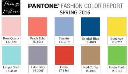
If you look on the website, Serenity is actually a blue.
It's hard to like or not like a color. In one context I might like it and in another I might not.
There's an article in Wired about how Pantone feels the choice speaks to gender neutrality as a topical cultural force, and the article has some interesting things to say about pink and blue in that regard :
__________________ I have come to the conclusion that buying craft supplies and actually using them are two separate hobbies. RachelRose Designs by Robin... GALLERY
If you look on the website, Serenity is actually a blue.
It's hard to like or not like a color. In one context I might like it and in another I might not.
There's an article in Wired about how Pantone feels the choice speaks to gender neutrality as a topical cultural force, and the article has some interesting things to say about pink and blue in that regard :
Good grief! Pantone colors are now political? What's next? Peanut butter?
I think it looks like cotton candy. And truly, I don't decorate with cotton candy. Might be nice for a baby shower...if you needed "gender neutral" colors. LOL! ;)
Third thought after reading this thread, how sad that politics was such a high priority in the decision making process. I'm not naive enough to think politics never enters into the decision process but it didn't need to be the driving force either.
Guess I won't be buying any trendy fashions this year... oh wait I never do that anyway, lol.
I thought it looked like it was in the periwinkle realm, too. Whether you like it or you don't, periwinkle is one of those colors that seems to look good on almost everyone. Maybe it's not only gender-neutral, but personal coloring-neutral as well...? I like both colors, but neither seems overly exciting. I'm not a trend setter or trend follower, though. I just quietly do my own thing with what I'm comfortable with, and let everyone else do that, too... ;)
And you know that these colors have been in production for a while, so the clothes and home goods will be in the stores, now that this is announced. I would like to see some flattering colors in clothing for a change. Periwinkle is one of my all time faves.
Looks as if SU will have dusty InColors again next year. I want some pretty brights again! The pink is pretty, but then I like pink. I'm reminded of the 80's with those new colors.
Periwinkle is my FAVORITE color to wear, so I am over the moon that it is called serenity. I also love rose quartz. Color me a light pastel shade of happy, peaceful, and.... serene with these color choices
The best line in this whole article was the one referring to last year's Marsala color as menstrual LOL.
Quote:
Originally Posted by Rachelrose
If you look on the website, Serenity is actually a blue.
It's hard to like or not like a color. In one context I might like it and in another I might not.
There's an article in Wired about how Pantone feels the choice speaks to gender neutrality as a topical cultural force, and the article has some interesting things to say about pink and blue in that regard :
Looks as if SU will have dusty InColors again next year. I want some pretty brights again! The pink is pretty, but then I like pink. I'm reminded of the 80's with those new colors.
What came to mind was that the colors dusty rose, pale blue and peach were in when I first got into d�cor years ago. These are pretty.
But I always like greens, reds really with a splash of terracotta to accent, lol........
Periwinkle I first met that color in my crayola box. Along with blue-green and green-blue, etc.
Pantone cant seem to make up their mind what it's about. In Dina's clip the are talking about mindfulness and serenity-very hot topic right now. In the other clip their quote has to do with challenging sexual boundaries.
I can not believe that writer said "menstrual" in relation to a color...I am no prude but that was coarse and unnecessary. And then has the nerve to call Pantone "derivative".
I had the same reaction-oh no, we are not going back to the Santa Fe color pallette please! (which to me was just adding grey to pastels) It looks good in the Southwest, but not elsewhere. I still have ugly buildings that went up at that time. :(
Well, let me add some demographic info here. Most everything except old-age products is marketed to Millennials now. In America at least, Millennials (who this year outnumber Boomers) are having children now. It so far is not at all the Baby Boom like post-WWII, but as an article on CNBC said "Even if the birthrates are very, very low, where the population is very, very large, we're still talking about a lot of babies." Is this THE reason Pantone chose these? Doubtful. But you'd have to be a fool not to include it in your trend forecasting, especially when the sight of the color pair brings babies to mind.
I like the Rose Quartz. I was bummed when SU retired Pretty in Pink. I agree with Diane (fionna51) on her take on the colors. I also think Buttercup is YoYo Yellow, Lilac Gray pretty similar to Wisteria Wonder, Green Flash looks like Green Galore and Snorkel Blue is close to Not Quite Navy, except maybe a tad brighter. It will be interesting to see what the new in-colors will be from SU this summer.
__________________ Mary ~~ QFTD #152, FS#514CC Guest Design Team 2012, 2013, 2017 & 2022 2014 CAS Spring Design Team MemberSC Guest Design Team 2015 & 2022 SU Consultant "Life's greatest adventure is finding your place in the Circle of Life" - Lion King
Is it just me - or did everyone on this thread compare the Pantone colors to SU colors?? And - only stampers would know this and not get a dazed look and say "they look like pink and blue to me..."
I like both of these colors. I love pink. The Rose Quartz is a touch too peachy for my taste, but still very pretty. I'm picky about my blues. Love the aquas, teals and stormy blues as well as pale blue, so I'm happy with this choice as well.
What does not make me happy is the need for political correctness when choosing colors of the year. What does that have to do with it? Funny thing is, they write:
"The prevalent combination of Rose Quartz and Serenity also challenges traditional perceptions of color association. In many parts of the world we are experiencing a gender blur as it relates to fashion, which has in turn impacted color trends throughout all other areas of design."
I don't see any traditional challenge. I see pink & blue, what many people think of as traditional girl & boy baby colors. If they wanted to challenge tradition, maybe they should have steered away from traditional colors, much less pick them both.
I don't see any traditional challenge. I see pink & blue, what many people think of as traditional girl & boy baby colors. If they wanted to challenge tradition, maybe they should have steered away from traditional colors, much less pick them both.
I think that the point they were trying to make is that those traditional colors are now being used in non-traditional ways - as in pink for boys and blue for girls, both for both, etc. - hence the "gender blur" comment...
Amber, if you love Peach Echo, then you definitely need to try Berry Sorbet by Papertrey Ink. It is my absolute favorite color in their lineup.
__________________ Linda E
Caution: You are entering an artistic zone. This is not clutter - this is creating. These are not pajamas - it's my work uniform.
Not everyone thought of SU colors; my thoughts as I saw the color palette were based on Papertrey's colors: Sweet Blush, Berry Sorbet, Blueberry Sky, Summer Sunrise, Aqua Mist, Stormy Sky, Pure Poppy, Classic Kraft and New Leaf.
__________________ Linda E
Caution: You are entering an artistic zone. This is not clutter - this is creating. These are not pajamas - it's my work uniform.