Splitcoaststampers.com - the world's #1 papercrafting community
You're currently viewing Splitcoaststampers as a GUEST. We pride ourselves on being great hosts, but guests have limited access to some of our incredible artwork, our lively forums and other super cool features of the site! You can join our incredible papercrafting community at NO COST. So what are you waiting for?
I have looked for a tutorial everywhere and tried to figure it out on my own, but I can't figure it out. Can anyone teach me how to make those trendy new watercolor backgrounds, please?
I have tried achieving these results over and over again with different colors, papers and techniques, but they always come out muddy of the paper warps so that the card doesn't lay down smoothly.
Is there a tutorial that you can suggest for me?
Use water to create the shape of the blob you want, and then drop color in... if your paper is warping, you might try taping the edges or using a heavier weight of paper... if your colors are muddying, you might have too much water or be overworking the color.
Here's a video from Dave from Memory Box using Twinkling H2Os...
...and one from Jennifer McGuire using Distress Inks.
Oh thank you for the links and advice!! I really love that look and I hate the "standard" ideas of backgrounds so this the look I love. I appreciate your time, Dina
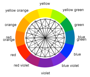
I just wanted to quickly chime in and add a something about the muddy/grayish colors. This happens when you use complementary colors (red and green, yellow and purple or blue and orange). If you're not familiar with complementary colors, they're two colors on the opposite sides of the color wheel:
So, as long as you avoid those complementary colors, you should have much more pleasant results and a nice color blend.
This tutorial might have some tips for you, too, even though she uses darker colors - you can do the same type of blending and layering with other colors too.
If you go to the tutorials on SCS and type in watercolor in the search box, here are lots of tutorials that come up. They won't all be what thou want, but there's some you will. The vintage watercolor is awesome and is Dina's stencil reflection!
This tutorial might have some tips for you, too, even though she uses darker colors - you can do the same type of blending and layering with other colors too.
I love making watercolor bkg. I tape my paper onto a cutting board from the Dollar Store using Painters Tape...stick it off and on your clothes to remove some of the tack and it won't tear your paper when removed. I let it dry on that board and I have a small piece of granite that I place on top of that. Anything heavy as it dries will help it lay flat.
Wow! These are all great videos! Thank you so much for linking them, everyone, this is exactly what I was searching for but couldn't find.
What amazes me is all the different ways and techniques that can be used to get the watercolored background look I want! I never thought of using alcohol inks or distress inks. I did try using my Tombows and watercolors, with pretty embarrassing and disastrous results. I think that was because of what Dina said, I was pushing the colors around too much and muddied them, and I wasn't using the best colors either, too.
These are all great tips and advice, thank you again, everyone!
I just read about Brushos, which I had not heard about. They look like the kind of watercolors I might be able to do. The thread started about Colorburst, but there are some great posts and examples of Brushos in the thread. Check them out:
I just read about Brushos, which I had not heard about. They look like the kind of watercolors I might be able to do. The thread started about Colorburst, but there are some great posts and examples of Brushos in the thread. Check them out: