Splitcoaststampers.com - the world's #1 papercrafting community
You're currently viewing Splitcoaststampers as a GUEST. We pride ourselves on being great hosts, but guests have limited access to some of our incredible artwork, our lively forums and other super cool features of the site! You can join our incredible papercrafting community at NO COST. So what are you waiting for?
I recently bought the Ink on 3 No line coloring ink pad and I cannot for the life of me get my images to look good. It works with watercolor and copic markers both and I just don't like what I am doing. I've watched some you tube videos on it and I think I'm "no line coloring" challenged.
Any advice out there? I'll show you one I am semi happy with. It's not the greatest but I think its ok. Now looking at it again, I guess I need to darken their eyes?! And the white ice cream just don't show up that great.
Have you checked the two tutorials and videos in the SCS tutorials. I can't remember which one I used but I found it very helpful. I just used Antique Linen distress for stamping with. I do feel that some stuff I've seen done with the InkOn definitely has what I would consider a line.
Searching the tutorials is pretty much broken at the moment, so here they are:
Hi Sherri! Amy Shulke of Vanilla Arts one of my favorites for coloring tips and tutorials. She uses colored pencils to add the final shading over alcohol markers. It gives you a greater deal of control than the brush does. The same color principles would apply to watercolors, but I haven't done much since we took the online class this summer :rolleyes:
This tutorial discusses the use of "ugly colors" for adding depth to coloring. I've been using more gray tones on the edges of images and it has made a difference. There's also one on coloring faces.
I think you're off to a great start - I'll tell you what I tell everyone in my classes - don't be afraid of the dark. All you are missing is deep darks, but it's scary to do. One trick I show is to take a picture with your phone. Switch it on the filter to mono or whatever your black and white filter is - you'll instantly see where you lack shadows. Color prejudices your eye and tricks it into thinking color is VALUE. But only value differences will make you happy, not color.
I think you're off to a great start - I'll tell you what I tell everyone in my classes - don't be afraid of the dark. All you are missing is deep darks, but it's scary to do. One trick I show is to take a picture with your phone. Switch it on the filter to mono or whatever your black and white filter is - you'll instantly see where you lack shadows. Color prejudices your eye and tricks it into thinking color is VALUE. But only value differences will make you happy, not color.
Thank you. I’ve never heard of this trick and I cant wait to try. I struggle with the dark ;)
I often stamp with a lighter to mid tone grey when scenic stamping. As a neutral and as a shadow color, it usually all but disappears into the scene I am creating. Maybe not a true 'no line' but pretty close. Amy of Beeswax stamps has always said stampers should try using other colors besides black to stamp with and that they could even use multiple colors on a project. Use the image as a guide for what color to stamp it in, flesh tones for people, grey for buildings, green or brown for trees, blue for ... well you get the idea.
I watched that video yesterday after posting here and I would not call that a "no line" ink. My first thought was it is a changing color ink, maybe with multiple layers of color it would become faint enough to disappear but I can do that in ways I already mentioned.
The ink could have some interesting applications. I would like to have seen her do something with a more solid image that has shading built into it. That would have been a better demo of the inks capabilities, imo.
I'm dating my stash now, do any of you remember Adirondack dye inks by Ranger?
I still have several ink pads that I reach for from time to time. There was one pad called Lake Mist (?), a very light neutral color that I used for stamping images for coloring with watercolor markers. The outline of the image would disappear as blended the watercolors. I need to re-visit those old ink pads and refresh them with Ranger's refresher spray and swatch them out.
i still have some of the reinkers from that line of inks. gorgeous!!
__________________ Dear Paperlicious is my blog...with a series on how I'm learning to improve my cardmaking by studying others.
I'm dating my stash now, do any of you remember Adirondack dye inks by Ranger?
I still have several ink pads that I reach for from time to time. There was one pad called Lake Mist (?)...
There were several really pale colours in that range that would work well for ‘no line” colouring. Latte was a little bit darker but also really useful for this. I still have (and use) loads of Adirondack dye inks - Espresso is an absolute fave for stamping when I want something softer than black but still very definitely there. Works well with Copics, too!
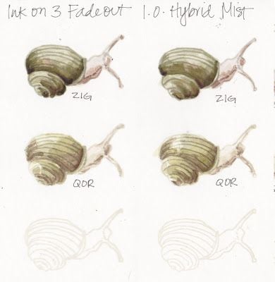
Very similar results, with one notable difference. Do you see it?
And I agree with Stacy as far as water media goes - the lines are definitely still there, and from a video I watched that is an intentional feature of the Fadeout ink.
I love fadeout - especially with real watercolor - first, it's perfectly neutral, which I've never found in another ink - but when you are first painting, the ink actually GRABS the pigment and the line is more prominent, and then fades as the watercolor dries. It's magic.
Interesting that the Adirondack ink was brought up. I still have a few of those pads and used the reinkers for them in today's MIX challenge : )
I've only ever used light colors for no-line water color, such as Distress Antique Linen or a pale Ranger Archival like Shadow Gray. It sounds like the Fadeout is something that would be nice to try.
__________________ Claudia Splitcoast Fan Club Member