Palette Blending with Copic Marker
by Lori Craig
Palette (and/or tip-to-tip) blending with alcohol markers is a great solution to working with a limited color range of markers or when working within the confines of smaller line art where there may not be room for more traditional blending methods. We show both methods in this fun tutorial.
Supplies

- Alcohol markers (Copic Markers used here)
- Image to color (Prairie Cheer by Power Poppy used here)
- Alcohol friendly blending cardstock (XPress It Blending Card used here)
- Alcohol friendly stamping ink (Tsukineko Memento Espresso Truffle used here)
- Scrap paper
- Small piece of acrylic or plastic (ie - old packaging, CD case, acrylic block)
Step-by-Step
-
Step 1
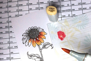
Palette or tip-to-tip blending is an excellent choice for blending colors of different hue in a small space, like flower petals. Here I am creating red flower petals up near the base of the flower that soften to a butter yellow at the tips. First I will show you tip-to-tip and then palette blending below. The methods are very similar.
I am working with Copic Marker YR31 and R37. ALWAYS use the lightest color value as your paintbrush, in this case the pale yellow - YR31. Holding the lighter marker as a paintbrush, gently lift the darker color from the red marker. Be careful not to overload your brush with the darker value.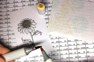
-
Step 2
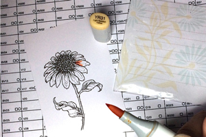
The idea is to pick up a little bit of the red that will allow you to add red where your marker first touches the paper near the flower center and smooth out to the butter yellow color as you brush across the paper toward the ends of the petals. Always put your brush to the paper where you want the darkest color/strongest intensity and work out to the softer colored areas.
-
Step 3
Work small areas at one time. Here I am working on 1-2 petals at a time, adding red to the centers and flicking (or brushing) out to the edge of each petal.
Clean your lighter brush (yellow here) between pick-ups of additional color (red here) on scrap paper off to the side. I do this between steps to keep my lighter brush as pure as possible. Remember, your goal is a small punch of red that fades to yellow, not turning the yellow nib completely orange.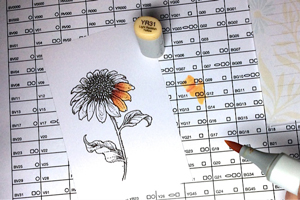
-
Step 4
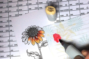
Some people prefer a traditional palette approach to this blending method. Using a palette is very similar to tip-to-tip in pickup and application to paper, but the darker valued ink is scribbled to a non-porous surface and lifted from the "palette" instead of another marker.
-
Notice the little bits of red on the yellow marker tip.
-
Step 5
As I work my way around the flower image, notice that you can see exactly how much ink is lifted from the palette. If people prefer the palette over tip-to-tip, this is generally the reason. There can be a feeling of greater control to loading the brush.
NOTE:
You cannot hurt the nib/tip or ink quality of the Copic Marker by combining different hues on the nib, but it is still a good habit to clean the nib frequently to maintain pure color, especially when you are finished with the specific colors you are using before putting them away.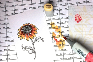
-
Step 6
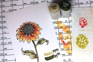
This technique also works well to blend markers of the same hue but with a large gap between value - especially in small or elongated places. Notice here I am using the darker value YG99 scribbled on my acetate for a palette and the lighter value YG91 as my paintbrush.
Remember, the lightest color is always your paintbrush.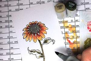
-
By palette (or tip-to-tip) blending, you can get a darker shading in areas of the leaves and stem under the petals and brush out to a lighter green color.
-
Step 7
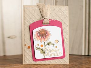
Use your colored image to complete a card or other project.
Video!
Your Turn
You've seen the tutorial, now you try it! We've got a section of the gallery set aside for Palette Blending with Copic Marker. Try this technique, then upload your artwork to the gallery. Show us your creations!
***Please note - Internet Explorer/Edge is not a supported browser, and will not allow you to see the videos. Please use Chrome, Firefox or Safari to view our tutorial videos.

Questions and Comments
We'd love to get your feedback or questions. Leave your comment below.
The card is absolutely stunning as well!!
Page 1 of 1 pages