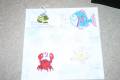
Which card? Top or Bottom?
I'm doing a kids class at a school...
10 kids, about 40 minutes...
Is the top one too plain?
Do the circles in the bottom one over-power the fish?
THANKS!!!
Date: Monday, October 16, 2006 GMT Views: 515
Favorited:4
Additional Info
Stamps: FIshy Friends, Simply Circles
Paper: bashful blue, green galore, only orange, white, brilliant blue
Registered: May 1, 2006 Location: Somewhere under the raindrops. Posts: 8624
Mon, Oct 16, 2006 @ 10:36 PM
That's a tough one, I think I like the top one better. Not sure why but I think because the Hello stands out well and I like the bubbles on the green layer. Actually, I don't want to make you change your card but I think it would work well to do the Hello in blue on the bottom like the first card and the bubbles in blue on the top like the bottom card to balance it out. If you did that, you'd need to leave the green layer plain or find some sort of muted bg for it I think. I hope this is helpful and not more info than you wanted. Looks like a fun card. The kids will like it! My kids would!
------------------------------ * Rhonda * SCS Gallery, Crafty Blessings Blog Successful people do the things that unsuccessful people don't. ~unknown~
I looked for a long time and have finally decided I like the top one better. They're both cute. But I feel the blue bubbles on the bottom overpower the card ... make it top heavy.
OR if you put the bubbles on the bottom on the bottom card I would like that also! HTH!
Registered: March 31, 2004 Location: Oklahoma Posts: 129
Tue, Oct 17, 2006 @ 6:03 AM
I think I would try combining them, use the bubbles on the top card but with the same blue color you used for the lower layer. then you get texture without too much "pop" of one color. I might try a darker green for the hello on the green card stock to make it show better. Hope that helps.... the kids will love it no matter what you do!
Registered: February 12, 2005 Location: VA...between the mountains and the ocean beach! Posts: 7893
Thu, Oct 19, 2006 @ 5:43 AM
I ended up with bashful blue bubbles on top and brilliant blue "sea grass" on the bottom. It really made a big change that I was pleased with. The green on green Hello shows up well IRL. Thanks for all your comments!


 HTH!
HTH!