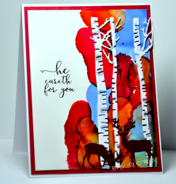
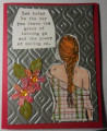
I used alcohol inks and birch tree dies. I colored the trees just a bit with Copics (gray), die cut deer, and added a sentiment. Finished and easy. I like to think the blue ink represents the sky and the other inks represent the autumn leaves. My card will go to a man in my church class. The stamp didn't show but I'm sure this came from 1 Peter 5:7...Casting all your care upon him, for he cares for you.
Date: Thursday, September 14, 2017 GMT Views: 1605
Favorited:13
Registered: January 20, 2016 Location: Freetown, Massachusetts Posts: 31437
Fri, Sep 15, 2017 @ 1:25 PM
STUNNING, Brenda! I love how you used the alcohol inks on just half of the card and didn't feel the need (as I always do) to cover the whole paper. It's just gorgeous (and also very encouraging!)
Splitcoast Dirty Dozen Alumni Favorites Team Notifier Splitcoast Challenge Hostess
Registered: October 26, 2009 Location: Oakhurst, near Yosemite Nat'l Park. Posts: 46766
Fri, Sep 15, 2017 @ 10:36 PM
Very cool card (except it looks a bit like fire in the forest which is taboo around here!!)
I love it though, the bg is so totally amazing and love those trees and deer! I have those in fact, how come MINE never looks this cool!!!!
Love it Brenda, I'm quite envious of your genius!
------------------------------ Blessings, Robin Encourage one anotherMy Blog-InkMagination , QFTD201,Dirty Dozen Alumni.Impression Obsession DT, DRS DT.Formerly HC DT, ODBD DT.