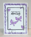
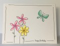
Love these pretty colors that Maura chose for use today! Too bad I had to skip dessert. My cousin's father-in-law just passed, so I needed a sympathy card.
This card was actually inspired by a billboard in Providence that I drive by on my way to work. It's for some health plan I think, but it has a blue circle and a black line drawing of someone's face in the circle. I find the design very pleasing to look at every morning, so I decided that I would sponge some circles in today's colors and stamp this simple line design inside them. I can't seem to stamp the butterfly without adding an extra layer to its wings. I think that's ever since I used this set for the stamp doodling TLC challenge in February.
Registered: September 7, 2007 Location: Miamisburg, OH Posts: 43141
Tue, Aug 22, 2017 @ 5:57 PM
I LOVE when stampers find unique ways to showcase the colors - which is exactly what you have done on your delightful butterfly card, sure to bring comfort!!
Splitcoast Dirty Dozen Creative Crew SU Design Team Alumni
Registered: May 18, 2004 Location: Southwest Michigan Posts: 36980
Tue, Aug 22, 2017 @ 6:35 PM
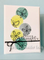
This is a great deign, Jennifer ~ and I love your inspiration being from a billboard; you never know when you'll see something that speaks to you! Love the whimsical flowers and butterflies and the dark twine sets those colors off beautifully.
------------------------------ Claudia Splitcoast Fan Club Member