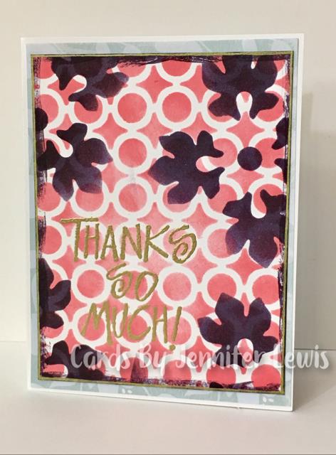
Karen might not think so, but she gave us really lovely colors today. But colors I would never ever think to use together. So I've paired this difficult color challenge with the TLC challenge to use two different stencils. And these two inks just look beautiful together. My only problem was that I don't have an ink that's close to Soft Sky and couldn't come up with a way to get the Soft Sky into the main panel. So I snuck in the Soft Sky as a DP to frame up the main panel.
Registered: July 19, 2010 Location: Conway, MA Posts: 7513
Wed, Jun 28, 2017 @ 10:51 AM
I love how you achieved a bold look with the colors and stenciling; I went on the softer side. The purple stenciling is so pretty against the pink circle design. Fab card!
------------------------------ Julie Proud Fan Club Member, CC595 Favorite, CC March 2017 Guest Designer, SC Winter 2018/19 Guest Designer
What a great card! I am so impressed with the depth of layering you achieved and how you paired the patterns so perfectly! The color palette is also a stunner. I always look forward to seeing your entries, so thanks again for sharing such a delightful piece with us for this week's Simon Says Stamp Monday Challenge!
------------------------------ Andrea Ockey Parr
SnappingMonsters.blogspot.com
Simon Says Stamp Designer, simonsaysstamp.com