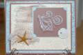
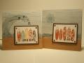
Heeheee---As usual, for me, this challenge was more like Less is Less than More is More. I made my card, then had to take things away for the challenge. It's just too hard for me to start out with less and add more---it's easier to take away in my head. Wonder what that says about me? ;)
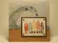
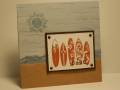
Since this is a masculine card, the bling is a little low key but it's there all the same. On the plainer card, I used my stardust pen on the surfboards, the sun, random sand specks, and the edges of the torn ocean waves (sponged vellum).
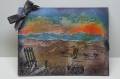
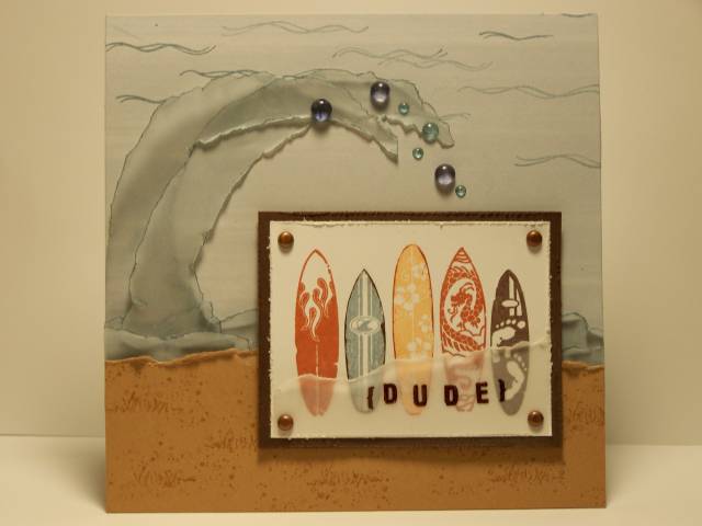
For the stepped up version, I used my stardust gel pen on all of the torn vellum edges including the piece with the sentiment and on random sand specks. I added the vellum waves instead of a sun (actually I guess I should say I took away the waves and added a sun and adhered some acrylic bling for water droplets. I added a torn piece of vellum for the sentiment and embossed the sentiment on the stepped up version. Also, for the more version I stamped the surfboards in different colors and cut them out to piece them over the main image. And lastly, I stamped grass as well as sand on my creamy caramel.
Registered: April 16, 2005 Location: Walla Walla, WA Posts: 15082
Sat, Aug 23, 2008 @ 10:23 PM
This is the coolest card! I think a young man who surfs would think this was the BEST card ever. Love the waves, the water droplets, the sentiment on the torn vellum, the distressed edges of the sand . . . . Perfect!


 and adhered some acrylic bling for water droplets. I added a torn piece of vellum for the sentiment and embossed the sentiment on the stepped up version. Also, for the more version I stamped the surfboards in different colors and cut them out to piece them over the main image. And lastly, I stamped grass as well as sand on my creamy caramel.