I was thinking of sending this out for Christmas this year. Can you give me hints on what I could do to improve it. I have never made my own Christmas cards but am thinking of being a demo in Jan and want to get my foot in the door.
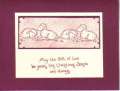
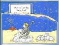
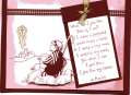
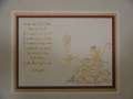
The card is white with a burgandy backing (the white opens). I sponged burgandy around the edging of the card. I outlined and colored the star gold & used a gold ribbon with burgandy eyelets to tie the gold in. I used the dimensional dots to raise the shepherd boy.
Date: Tuesday, October 26, 2004 GMT Views: 3767
Favorited:24
I love being asked for my opinion on how to improve things, so I'd like to take a stab at this, even though I agree with everyone else's comments that it is beautiful. (Just use the following if it is helpful, and ignore the rest.)
When I'm working on a card,I go as far as I can with it, then lean it up against something so it is the first thing I see when I enter the room. Sometimes I ask it, "What else do you want from me!!!"
When I look at this card, the first thing I miss is another color. Sometimes U.S. Vanilla or Natural Ivory C/S serves as a second color, but White doesn't seem to. (Vanilla and Ivory also look less stark than White when partnered with the dark, saturated colors such as Baroque Burgundy). I would look through the Idea Catalog or SCS gallery and look at color combinations that look good with Burgundy (e.g. Night of Navy, Forest Foliage or Mellow Moss--cool colors to balance the warmth of Burgundy) and then try to introduce them into the card in the highest impact/lowest effort sort of way. Because the shepherd is raised on dimensionals, I might try a quick squiggle of color with blender pen or aqua painter on the ground and/or sky portion of the card (helping to create more of a night scene as well as foregrounding your exquisitely cut out shepherd), then I would try to reintroduce that color by using it for the C/S around the poem or a second frame around the card.
I would certainly consider doing some ripping, possibly on the top edge of the C/S framing the poem. (I think ripping can add a sense of texture and warmth, while frequently being faster than precision cutting.)
For balance, I would consider separating the eyelets a little more, as well as use a contrasting color of eyelet so it shows up better (maybe choose an eyelet color that repeats one of the other colors). I would even prefer gold over the perfectly matching Burgundy eyelets because. . .
the star is the focal point. When I use a metallic as part of a focal point, I try to repeat it two other places, and gold eyelets (or even brads--a time saver) would be a coordinating alternative.
At the risk of being way in the minority, I wouldn't choose the burgundy gingham ribbon for this card, but I'm not a fan of this ribbon, and I think gingham competes with the style of the image and trivializes the message. In any case, I think it would be more effective to use organdy ribbon with gold cord, instead of two different ribbons.
If you enjoy embossing I think this card would show it off well, on the star and/or the poem. Embossing one card adds a lot of time, but doing several in a row production style adds impact and repeats the gold.
If you do try this with Vanilla or Ivory C/S and miss the whiteness of the sheep, the aqua pen dipped in white craft ink (refill or, what I've been doing, squished on the lid of the pad) produces a very satisfying result.
Hope these thoughts are helpful. None are meant in the least way critically and are really just a reflection of my approach.
------------------------------ "I like work. . . I can sit and look at it for hours. I love to keep it by me: the idea of getting rid of it nearly breaks my heart." J.K.Jerome
Registered: October 12, 2004 Location: Charleston, AR Posts: 1008
Wed, Nov 24, 2004 @ 6:59 AM
I think it is a great card, i love the ribbon and the simplicity (lack of additional colors) of it due to the message of the card...I think the colors are great, it will be a lot of work but everyone will love them
------------------------------ My avatar is my adorable niece, she makes me smile, thought she might make you smile too!!
Registered: December 3, 2004 Location: Bourbonnais,IL Posts: 8349
Tue, Jan 04, 2005 @ 10:01 AM
It really is a beautiful card ! I may be casing it for our Christmas card challenge! If you do something like this in future (cutting), think about just cutting a small area. For instance , in order to place the poem, stamp the shepherd on the card front and cut out around only the staff. You could use a craft knife for that part with a self healing mat. Keep up the great work!!
------------------------------
Kim
"We must not, in trying to think about how we can make a big difference, ignore the small daily differences we can make which, over time, add up to big differences that we often cannot foresee."