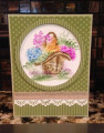
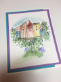
This may be the very first, or the 2nd piece I ever water colored the Art Impressions way, and I immediately hated it because I used too much water.
This piece has been in the trash bin several times and pulled out and tossed in my bone pile to sit for years. However, this week's Teapot Party seemed like the perfect time to use this piece. This card is going to a very dear lady who is battling some serious health issues so hopefully it cheers her up a bit. I could not fix the mistake of using too much water on this project, so I used my other trick of drawing the eye away from it by placing a frame around the image and using a punched border with burlap ribbon. I am also entering this card into this week's alphabet challenge for the letter P which is the pink I used. In the end, I am glad I kept this piece because I actually like the end result. Who knew? Thanks for looking! ~Karen.
Date: Friday, June 8, 2018 GMT Views: 659
Favorited:4
Registered: June 27, 2012 Location: Washington Posts: 25246
Sun, Jun 10, 2018 @ 3:59 AM
Karen, I love the effect you've achieved with your too much water watercoloring! It surely looks intentional...giving such a soft and serene look to your basket of flowers and the framing is wonderful. Love your use of striped and dotted papers together with the lacy white border and burlap! Your "mistake" turned out quite delightful!
------------------------------ Carlene aka Chatterbox-1--My BLOG; My Pinterest;My SCS Gallery; FAVORITES Team Member; 2022 Christmas Card Challenge 75/105. My SCS Goal: Challenge Catch-up; Sketch Challenge Sample Card Team (August 2022--January 2023).
Registered: February 28, 2010 Location: Eastern Ohio Posts: 6277
Sun, Jun 10, 2018 @ 4:07 PM
They always say to set aside and come back another day to projects not liked and they most often will be liked---turned out so very sweet and like the dp papers used.
Registered: August 30, 2006 Location: in the sunny south Posts: 9834
Wed, Jun 13, 2018 @ 7:27 AM
I really love that you gave this image a second chance! It is quite lovely on this card! I like the misty and clear parts of the flowers. You did a brilliant job of framing the image and I love the papers you used.
------------------------------ Pat Scatter Joy! Throw kindness around like confetti!
Registered: November 7, 2009 Location: Sacramento Posts: 39187
Sat, Jun 16, 2018 @ 12:02 PM
This is so pretty, Karen! I think you are too hard on yourself. I have wanted to try the AI watercolor stamp line but haven't acquired any stamps to do so. I really like what you did here and framing it with the stripes and polka dots is such fun!
Registered: August 27, 2014 Location: Santa Rosa, Texas Posts: 12127
Mon, Jun 25, 2018 @ 6:51 PM
Hold the phone! I'm no artist, but this is beyond beautiful and gorgeous put together. And I'm definitely not an art history major or anything, but isn't this what the impressionistic artists tried to do? This is a masterpiece. You probably couldn't recreate it if you tried. I love your colors!!!