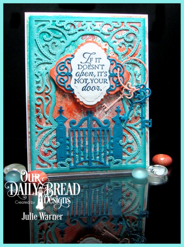
These are my kind of colors! I love the complementary contrast of the turq/teal w/ the coral/orange.
I made a Wrinkle Free Distress bg on w/c paper. I did the turq/teal colors first, leaving some white space & when it dried, I did the coral/orange colors. Doing the colors separately helps prevent getting muddy colors. After it dried, I die cut it w/ the largest matting basic die so it would be just a tad bigger than the turquoise Vintage Flourish Pattern die cut. Before I attached it, I sponged just the edges of the turq to help better define them. I tucked the Gilded Gate in the bottom of the turq. die cut & stamped the greeting w/ the Versafine onto a small Vintage Label die cut. The coral orange layers were also die cut, the edges sponged & I added just the fancy ends of the smallest Vintage Flourish dies cut out of teal, on top of the coral. The die cut Keys were threaded thru the lacy teal layer.
Thanks so much for looking! Closeups & the inside are on my blog: The Write Stuff
Date: Tuesday, March 29, 2016 GMT Views: 1483
Favorited:5
Registered: January 6, 2004 Location: Connecticut Posts: 20543
Tue, Mar 29, 2016 @ 5:38 PM
So elegant!
------------------------------ Rediscovering the simple joy of stamping and exploring my art! Stamp your ART out! Share your thoughts. Let your heart sing.
Come check out my Gallery and leave a comment!
FS465
Splitcoast Dirty Dozen Splitcoast Challenge Hostess Proud Fan Club Member
Registered: September 24, 2007 Location: WA Posts: 13991
Tue, Mar 29, 2016 @ 5:43 PM
Oh, Wow! I have never heard this sentiment before, and I am in LOVE with it. I also appreciate the tip about doing the colors separately for the background. This card is stunning! Love the keys on the ring and all the other die cuts. Ooooooh . . . . :-)
------------------------------ Barbara Splitcoast Dirty Dozen My website: Inky Fun SCS Fan Club Member Color Challenge Team Member QFTD215