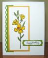
Still trying to complete a few of the sympathy cards I need. This is for our DIL's Mom who just lost her mother.
Love this week's sketch challenge - thanks Roxie for your dedication to getting these challenges posted for us!
I see I'm still a bit stuck in the blue tones but apparently those are the colours that 'speak to me' right now. And I always thought green was my favourite colour. Colours used are Not Quite Navy and Baja Breeze - coloured the image with an Aqua Painter.
Pretty straightforward layering; a little bit of inking on the edges of the white layers; Versamarked the long narrow strip on the right with the leaf image from the Natural Beauty set; used Swiss Dots ef on the Not Quite Navy panel; Versamarked the Script bg stamp on the main layer since it was still out on my desk from my Pounded Posies card. I am so ribbon challenged... A few stickles on the flower centres - maybe should have left that well enough alone... Wanted it flat for mailing so no pearls or rhinestones.
Thanks for stopping by! Always appreciate your comments...
Punch tally: None! GASP - I'll have to punch something on the inside layer I guess?!?!?!
Date: Wednesday, June 30, 2010 GMT Views: 4619
Favorited:82
Registered: November 3, 2005 Location: Fairport Harbor, OH-IO, Lake Erie shoreline Posts: 60268
Wed, Jun 30, 2010 @ 11:15 AM
Izzi this is beautiful and perfect colors for sympathy. Your flower is colored so gorgeously and I love the hint of blue on the white c/s. No punching for me today either!!!
------------------------------ Karen ~ Thanks for stopping by my gallery. Proud Fan Club Member - FS525, QFTD49 Life is better in a beach town!
Love this! It went into my faves! I love your colors (my very favorite 2 colors all the time) and that ribbon/bow! The background is great too. I think this makes a very elegant sympathy card. I need to make some to have on hand. Great sketch card! TFS
♥♥♥
------------------------------ Sharon ♥
Blog: Foxy Stamping Scrapbook Goal: 2024: 14/60 as of 03/31/24
Registered: July 9, 2008 Location: Stars Fell on Alabama Posts: 74960
Wed, Jun 30, 2010 @ 2:58 PM
What a beautiful card you made for this sketch. The colors are beautiful together. Sorry you're needing all these sympathy cards. They are sure to be
a lift to the recipient.
------------------------------ My Blog---My Gallery---My PinterestI'm a Punchkateer! (Prez) FOREVERDirty Dozen Alumni2014 CAS Spring DT--- Inspiration Challenge Co- Hostess 12/02/17-12/28/19 Watercolor Wednesday Design Team Hebrews 13:2Brenda
Registered: May 18, 2008 Location: Virginia Posts: 24623
Wed, Jun 30, 2010 @ 4:31 PM
Da Diz, you know how much I LOVE blue and white, so this one really hit home with me. Such perfection in your cards. So beautifully put together and all was going well until I read the part of the "posie killing"!! It started me all over again. Oops, that may not be appropriate since this is a sympathy card, so I will broach that subject another time now that I think of it. It really is a beauty and no extra embellies needed at all. Your coloring is great and love the b/g stamping and ribbon!! No punchez, we'll let you slide this time, but it appears Kookzi has sent you to your no punchez time out chairz!!! Yikes, you better get a punchin' soon!! Hugs and I know your DIL's mother will really appreciate your beautiful work, prayers and thoughts!! Hugs . . .
------------------------------ Pam Co-Founder of The Punchkateerz! Fan Club Member FS149, QFTD44