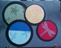
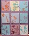
For those of you who know my work, one thing you will know is, when I see an inspiration challenge, I like to do literal translations of the images seen. I like to pick up all the details. Today is no different.
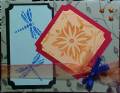
I chose the top display to literally copy.
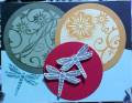
I mounted all my images on black. the green is mellow moss with almost artichoke (fresh cuts was used here), the next image is apricot, with marigold morning stamped (delight in life is the set here.)
Next I used real red, I took a stencil, used a stencil tool, and dabbed it in versa mark over the stencil, then I used bridal ep, and heat embossed the image.
The last image I used brilliant blue and soft sky. I wanted to show the two colors of the bowl in the front image. I stamped in cool carribean and brilliant blue.
I took a second look at the image, and I noticed it was shaded quite dark near the top of the display, so I took a sponge, dipped it in basic black ink, and rubbed it across the empty portions of the top of the card.
What do you think?
tfl
Date: Saturday, July 5, 2008 GMT Views: 1097
Favorited:2
Registered: March 21, 2006 Location: sunny southern california Posts: 20098
Sat, Jul 05, 2008 @ 12:24 PM
Wow, love the contemporary feel to this sketch.
------------------------------ christine m.aka summer and weekend stalker DOT INK (My yadda yadda) Don't magnify your problem . . .Magnify your God
PROUD MEMBER OF THE REDDIVAS!