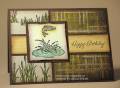
Iliked how she has her scalloped image circle tucked inside the half scalloped circle on her card.
Since I needed a masculine card, I changed the following:
1. colors
2. stamp sets
3. used solid Nestabilities vs. scalloped
4. used 3 brads instead of flowers
5. used photo corner punch and one brad for corner treatment
6. added a bg stamp to colored panel
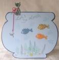
I colored my image with Copic markers and then hand drew the weeds and cattails with SU markers.
Date: Sunday, April 6, 2008 GMT Views: 2585
Favorited:6
Registered: March 21, 2006 Location: sunny southern california Posts: 20098
Sun, Apr 06, 2008 @ 1:10 PM
Great guy card. You dad is sure to love it. yes, this sketch is a good one! I like the brad treatment on white - really gives is a punch!
------------------------------ christine m.aka summer and weekend stalker DOT INK (My yadda yadda) Don't magnify your problem . . .Magnify your God
PROUD MEMBER OF THE REDDIVAS!
Registered: June 10, 2007 Location: BC Posts: 44872
Sun, Apr 06, 2008 @ 1:29 PM
Yes Charlene - fab layout!! I'm going to change up my today's FS layout to a something like this - a square card - looks great!! Love your image too - beautifully coloured as always!
Registered: July 17, 2005 Location: Staying inky in eastern Connecticut Posts: 79205
Sun, Apr 06, 2008 @ 1:41 PM
how very cool is this masculine card....love the unusual elements in the bkgd which really focus your attention to the image while giving a unique look to the whole presentation...awesome, my dearie
Registered: July 7, 2006 Location: Senoia, GA. Posts: 34466
Sun, Apr 06, 2008 @ 1:49 PM
Wonderful masculine card, Charlene! Love this image and I think you did an awesome job drawing the cattails and greenery! Great coloring! Love the design and all your changes!
------------------------------ Fran MY BLOGMY GALLERY Proud Fan Club Member