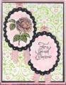
Please help and be honest I can take it (former Marine). DH looks at card and says the usual "That's Nice" and then makes a face and says its missing something. Maybe its off balance I don't know so I'm calling on all you wonderful stampers to help me out. This is my case of Renee's card that you can find here: Thanks So Much by prchvs at Splitcoaststampers
I changed colors, stamp set, ribbon and sentiment placement and I moved the main panel a bit.
Date: Sunday, February 3, 2008 GMT Views: 1953
Favorited:4
Registered: February 2, 2006 Location: Sherwood Park, Alberta, Canada Posts: 769
Sun, Feb 03, 2008 @ 2:00 PM
Hi! Love the layout but the yellow backing just doesn't make the card "pop". I'd try something darker, even (dare I say it?!?) - black or a very dark green. Best of luck!
------------------------------ Judy
Of all the things I've lost, it's my mind I miss the most.
Registered: December 8, 2006 Location: currently stationed in Norman Oklahoma Posts: 11275
Sun, Feb 03, 2008 @ 2:09 PM
I would have to say a darker background where the green is..sorry.
Bonnie
------------------------------ Bonnie~Proud Fan Club Member~Marine Wife My Gallery~One of Kota's Kids My Blog~Bonnie's Creative Corner Every Job is a Self-Portrait of the Person Who Did It. Autograph Your Work With Excellence.~Author Unknown
Registered: December 25, 2005 Location: Drinking in God's Good Grace...! Posts: 42119
Sun, Feb 03, 2008 @ 2:51 PM
I like it...I would actually take away the ribbon, and use a bckrd stamp like canvas to add texture to the green ...
HTH!
Stampergrl
------------------------------ "God designed the human machine to run on Himself. HE Himself is the fuel our spirits were designed to burn..." C.S. Lewis, Mere Christianity
Registered: November 22, 2005 Location: Posts: 7053
Sun, Feb 03, 2008 @ 3:54 PM
I actually like it the way it is! Perhaps you could do something to the green to make it a bit more 'textured'? I don't know ... This still looks good, lovely colouring, thanks for playing!!
Registered: July 29, 2004 Location: Maryland Posts: 6251
Sun, Feb 03, 2008 @ 5:51 PM
Love it. Love the beautiful stamps. I was thinking maybe repeat another green layer behind the yellow in middle, move up a little and a couple of brads or something underneath. JMHO. TFS
Registered: April 7, 2007 Location: Missouri Posts: 13672
Sun, Feb 03, 2008 @ 6:19 PM
I like your embossed panel and your flowers and coloring are wonderful. What I noticed on Renee's card is she stayed with the blues so it all ties in together. I am far from an expert, but wonder if a more mono type card would work. That being said-very pretty card! tfs