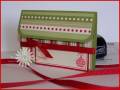
I made this card for my aunt who lost her dad last week. My husband thinks it is too dark...what do you think? PLEASE be honest, I can easily redo it in groovy guava or some other more cheerful color. I would hate to send her something that would depress her.
Registered: June 12, 2003 Location: Glendale Arizona Posts: 640
Mon, Dec 17, 2007 @ 6:30 AM
Personally, I think your card is very soothing. I love the colors. Even though it is going to a woman, if conveys your thoughts about her Dad and the more subdued colors tend to be more masculine. Also, I think the flowers convey hope for the future. Great job and I am adding it to my favorites.
Registered: May 28, 2004 Location: My very hot stamp room, in Phoenix! It's a dry heat. Posts: 38730
Mon, Dec 17, 2007 @ 6:32 AM
I really like your card, but I think I agree with your dh on the colors. You might just do the flowers in a color. I really do like the layout and the look of this card a lot.
Registered: April 20, 2005 Location: The only Eaton Rapids on the Earth, Michigan Posts: 57568
Mon, Dec 17, 2007 @ 6:45 AM
Wow! I think your sympathy card is absolutely beautiful as it is!! It would not depress me. However, if you think you need to add a splash of color, maybe you could stamp one more flower in color with your other flowers. KWIM?
I love this card and the layout. If you wanted to add a touch of color, maybe the center stamped set of flowers could be done in color, but the bordering stamped flowers remain in the gray tones. The center colored portion could be the bright side of life that remains in everyone's hearts. TFS!
Registered: May 19, 2006 Location: Missouri City, TX--Howdy Y'All!! Posts: 197
Mon, Dec 17, 2007 @ 6:48 AM
This is a beautiful card...The colors are respectful of how she must be feeling. I think that bright and colorful sympathy cards say to the receiver--You should just cheer up! Soothing colors like this convey a feeling of understanding that this is a hard time and that you truly recognize that. Beautiful card...into my faves!