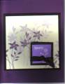
I saw this beautiful card on page 56 in the Paper Made Easy magazine. (October 2007 issue) I tried to copy, but I don't like it - it is just too plain.
I would like any and all comments.
ps: my scanner is creating a shadow - something else to do tmo
Date: Thursday, October 18, 2007 GMT Views: 841
Favorited:3
Additional Info
Stamps: Garden Silhouettes
Paper: Elegant Eggplant, Basic Black, Very Vanilla
I love the background and your colors. I'm not sure I like the bright purple square. It takes away the classy going on behind it. It's almost like you laid a book of matches on your card.
Registered: June 9, 2005 Location: Ohio Posts: 126
Thu, Oct 18, 2007 @ 3:51 AM
I love the flowers. The shading is gorgeous. I agree that the square takes away from teh beautiful floral backround. How about a sentiment on ecru on the colored part. Still a pretty card.
Registered: May 15, 2005 Location: OHIO Posts: 604
Thu, Oct 18, 2007 @ 5:04 AM
Agree also - The background is awesome - The way you shaded the top looks like it fades into a foggy day. I love the way you did the background. The bright purple square takes away from the soft look.
Registered: January 13, 2007 Location: Lake Bonaparte, NY and New Port Richey, FL Posts: 279
Thu, Oct 18, 2007 @ 3:16 PM
WOW! Those previous thoughts match mine exactly! The background is fabulous....why not just stamp a word or phase right in the bottom corner of that? It does need a ribbon or hodgepodge somewhere.....