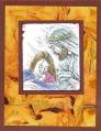
I love this set and am hoping to use it for the majority of my Christmas cards this year. I also love this cut on the card. This card definately is in need of improvement. Any suggestions?
Thanks for looking!
Date: Friday, November 17, 2006 GMT Views: 1199
Favorited:4
Registered: February 23, 2005 Location: Red Sox Nation Posts: 12105
Fri, Nov 17, 2006 @ 7:55 PM
I think the white inside layer is too much contrast against the navy. Try Brocade Blue with Navy stars. Also, there's some stray embossing powder which is a little distracting. The embossing buddy should help. I like the distressed edge to the main image. Maybe some brocade or navy sponged lightly aroundthe edge might help soften it? Overall, I like the card.
------------------------------ Debbi - SU Demonstrator My SU Website
Visit me on Facebook
Registered: February 16, 2005 Location: Elgin, IL Posts: 4489
Fri, Nov 17, 2006 @ 9:41 PM
I would say keep it simple... the zig, zag thing just might be too much, with the white background... it sort of makes it look like your main image is crooked... try to just do this layout in a standard card... main image on top...raised on dementionals... bottom sentement embossed in bold... DONE!
i agree it's a nice card. I would also change the inside from white to btocade blue and I would mat the main image maybe with brocade blue to tie it all together. Hope that helps.
Registered: September 15, 2004 Location: Washington State Posts: 719
Sun, Nov 19, 2006 @ 12:51 AM
Although it's not unattractive I think I would use a very pale tan... maybe Sahara Sand in place of the white pieces. Both under the front stamped image as well as the inside panel. Then stamp in navy.
The gold embossing is a little hard for my eyes to read, but that could be my monitor or the fact that it's nearly one AM here! LOL...
Tiffany
------------------------------
Art washes away from the soul the dust of everyday life. ~ Pablo Picasso
Registered: March 6, 2004 Location: Casa Grande, AZ Posts: 28932
Mon, Nov 20, 2006 @ 3:50 AM
Very nice coloring - really like your choice of sentiment and image. I did a lot of embossing for our Christmas cards. I notice a couple of people mentioned the words. I wonder if you used the ultra fine (or whatever it is called) ep - it made SO much difference when I embossed. I got a 1 ounce jar at Joann.com for something like $3, and only used about 1/4 of it. I did find that the detail stamp and word stamp I used were tricky but they look so nice when embossed.


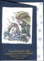
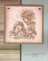


 I think a gold mat under main image would be great. Change one thing at time if you change at all, tfs with us...