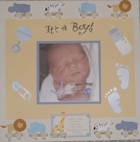
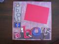
This is my announcement page for my scrapbook for my son. I am worried that it's got too much on the page. Too crowded. What do you think? Honest opinions! Thanks!!
Date: Saturday, September 30, 2006 GMT Views: 456
Favorited:3
Registered: February 14, 2005 Location: Northern B.C. Posts: 2156
Sat, Sep 30, 2006 @ 10:30 PM
A very cute picture but I think it is lost by the 'floating' images around it.What about double mounting the photo to make it stand out and then maybe something in one corner?
Registered: September 7, 2005 Location: Winnipeg, Canada Posts: 104
Sun, Oct 01, 2006 @ 6:52 AM
Hi,
I'm more of a scrapbooker than a card maker so I'll gladly give you a couple of my thoughts.... First of all, it's a great photo! Good choice for an intro page. I'd enlarge the photo and use blue, maybe even 2 hues of blue and white paper for matting and the background page. I find it a little busy and the baby almost gets lost in all the stickers. You want the focus on that beautiful little boy of yours! The bottom row is cute and with a larger photo that and the title would be enough.
------------------------------ Kim
It's only an addiction if you're trying to stop....
This is a great page as in intro! I like all the animals along the top and bottom. I would also inlarge the photo--it's such a great pic! (thanks for sharing this--I haven't done the intro page to my son's baby album yet...this is good inspiration)
Registered: April 18, 2006 Location: here silly Posts: 56914
Sun, Oct 01, 2006 @ 5:12 PM
I love the photo and agree to enlarge it. I also love the top and bottom aminals but the ones around the photo may be a little to much. This is going in my favs since I still need an into page for my little one1 TFS~